This post appeared in a previous blog and is here for posterity’s sake.
Chapel of St. Ignatius, Seattle, originally uploaded by douglas
Here is a silly article concerning Steven Holl’s Chapel of St. Ignatius by Charles Mudede entitled, A Post-Occupancy Evaluation of the Chapel of St. Ignatius:
This is what it all comes down to: Can a God-fearing man who needs a moment with his perpetually man-mad God kneel in this chapel and feel the Lord’s presence?
…
I believe that it’s hard, if not impossible, for God to hear the prayers in the Chapel of St. Ignatius. When you are in the Chapel of St. Ignatius, it’s hard to pray because prayer is supposed to be done with closed eyes but all one wants to do is look at the pretty lights pouring through skylights and colored windows, particularly the blue one above the altar and the cross that hangs Jesus. There hasn’t been a time that I have entered the chapel and felt the seriousness of God; what I notice are the play of light, the curves, the crazy-looking tree growing out of the floor in the Reconciliation Chapel. The space is too complex for God, too designed for His simple presence. God is simple, he is just one thing, one All, and all you need to praise His oneness is a clearing, a direct space of worship. As at Ronchamp, the architect, not God, is worshiped in this box with bottles of light.
The building is not about Him, but about its architect, Steven Holl, who lives in New York City.
I haven’t read a criticism of architecture this inane since Herbert Muschamp left The New York Times. Two quick points: First, this review is not a A Post-Occupancy Evaluation
, being that no actual research into the building was done besides complaining it has too much light. Second, nice jab at New York City, since it really matters.
The author’s thesis (which he only supports with a few sentences) boils down to this: churches can’t be shiny, light-filled or too complex
because this reflects man’s glory, not Gods and cites Ronchamp as glorifying Corbusier, not God.
In a word: crap.
Cathedrals, churches, & chapels celebrate both God and man. Who pays for the chapels? Rich people who want to secure a place in their community or in the afterlife. Twas was, and will be.
Are we to believe, reading his article at face value, that God does not reside at religious buildings with too much light and too much “complexity?” Is he really saying this? Because it appears like he is.
So, according to Mr. Mudede’s conception of “acceptable” religious space, the following spaces God does not reside:

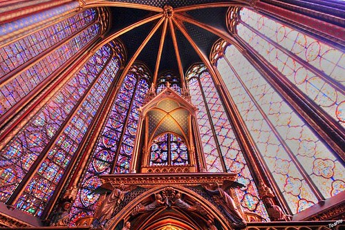
The Stained Glass of Sainte-Chapelle by * Toshio *
It’s obvious that Sainte-Chapelle in Paris is way too distracting, and lets too much light in. Better not go there to pray since God isn’t there.
Let’s look at another one:

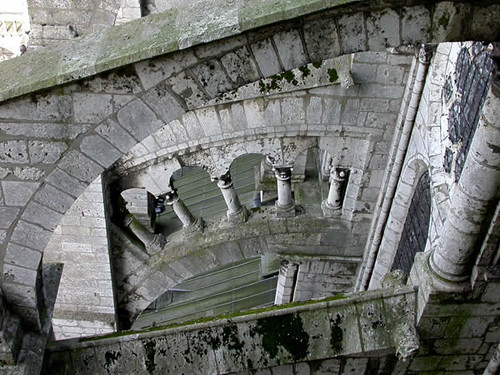
Chartres – Flying Buttress
Whoa, whoa! Hold still, buster. What are those things? Are those flying buttresses? Why is it so complex? Couldn’t they just build a flat wall? I mean, come one! Give me a simple, blank wall and I can pray there.
OK, so if French Gothic is not your style what about something a bit newer:

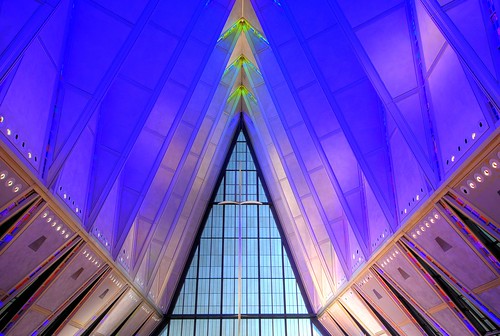
The Cross by Iceman
And this one! Why would the US Air Force build such a distracting edifice which would discombobulate the cadets? Didn’t they realize how much concentration those fly boys (& girls) need?
All joking aside, it seems that while Mudede has been called a leftist culture critic, it appears that he left his Marxist analysis at the door; rather than analyzing why religious buildings are they way they are (see white, rich men) by analyzing wealth and structural inequalities, Mudede falls back on the laziest canard possible:
It isn’t good because I don’t like it.
The article isn’t an architectural critique at all, but a meandering view of theology, which makes it even more subjective than architecture. I’ve never thought of god as serious (udders, the platypus, etc.), I’ve never been yelled at for keeping my eyes open while praying, and I definately wouldn’t categorize god as simple. But these are theological issues concerning a supposed higher power. And grubby is right on target with his examples. What I expect to find out from a POE is, does it work for the users, and are the owners happy with it? Does it do its job while keeping out water, letting in light, and maybe doing both with some decent aesthetics?
now that’s an old school rant!!
I felt like ranting.
Good point Sweetchuck, you can never win a theological argument, or arguments using similar tactics.
That review was spoken like a true Hypocrit-Protestant (and oft overlooked sect that like their walls beige, their sermons beiger, and their crosses wooden, DAMMIT!)
Churches have long been about opulence and grandeur. It’s easy for someone to suppose that glittering gold and 120-foot-high ceilings distract from the godliness of one’s experience, but the fact of the matter is, all of those bits of wonder were added to religion to inject the awesome unattainable into the common man’s religious experience. Ask the people that go to the gilded Megachurches whether it’s holy enough for them.
Also, priests just like to drink out of golden goblets. That shit ain’t free.
I would assume that to come up with the “shiny=distracting” evaluation, a thorough paritioner survey would be the thing to look at. As grubby and sweetchuck say, it’s hardly a POE.
But Samuel L. Jackson taught me that making an assumption makes an ass out of “you” and “umption”, so maybe I’m wrong.
If he thinks pretty = distracting I’d hate to see his wife.
I think J-Dubs nails it on the point that shiny things=asses in seats. Hell, if somebody is going to tell me that I’m a sinner and am going straight to hell, I would much rather do it with the BBJ basking in soft blue light and some priestly bling. Beats the crap out of the slightly yellowed ACT ceiling that we had in my synagogue growing up…