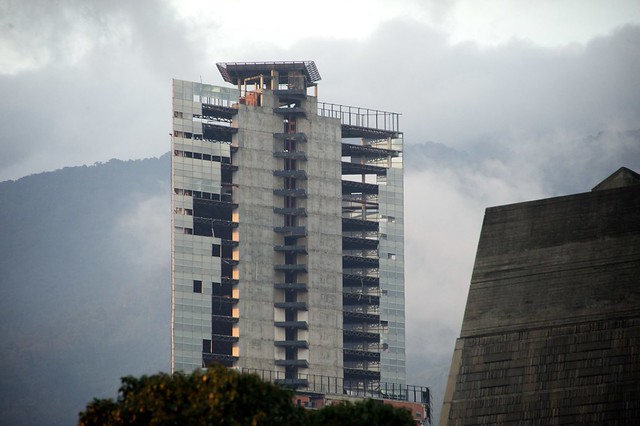
The 45-story Torre David office tower in Caracas, Venezuela, was nearly complete in the early 1990s when a pair of events changed the building’s trajectory forever: First, the project’s developer, David Brillembourg, died in 1993. Then, the next year, Venezuela’s economy cratered. Torre David, about 90% finished at the time, was abandoned–as both a project and a property. Electrical infrastructure had not yet been installed. The lower stories were still missing finished flooring, sewage pipes, and paint. Large slabs of marble meant for a luxury hotel on the first six floors had been carted into the building but never installed.
Category: Architecture
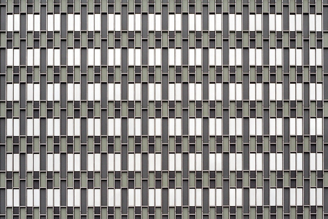
Aronoff Center for Design and Art Facade Replacement Webcam
As you all know, I’ve been obsessed about Peter Eisenman’s Aronoff Center for Design and Art Facade replacement project, which has ballooned to a $10 million facade renovation. So it’s nice that I can cyberstalk the DAAP building via webcam to see how they are fixing the facade. I think after total cost of initial construction and renovation, the university should have committed to a better facade construction system in the beginning instead of renovating the building every five years.
They should keep the building the grey, as shown in the above webcam capture.
East Village Studio by JPDA
Here is an awesome video of the East Village Studio from JPDA, which I did very minimal work on (mostly critique and materials), featured on the Tiny, Eclectic, Amazing Spaces SpacesTV YouTube channel:
What Facebook’s New Campus Design Tells Us About the Company
Facebook wants us to know that its values are Gehry’s values. Further evidence of a creative mindmeld: Gehry works in a warehouse; later, we hear that this design that so shares Facebook’s values will be like a “warehouse.” Facebook isn’t just saying we really get along with our architect. It’s identifying the type of creativity that it takes to run and grow a successful social media company with the type of creativity it takes an artistically serious architect like Gehry to design a building. The comment about wooden models is also a gesture at the valuation of craft — a central part of the artist’s work – that puts it on par with “state-of-the-art” software. Why might Facebook want to associate itself with tactility, with craft, and with the physical world — all those things that the Internet has been accused of disappearing?
What Facebook's New Campus Design Tells Us About the Company – Design – The Atlantic Cities.
Washington DC Union Station Master Plan
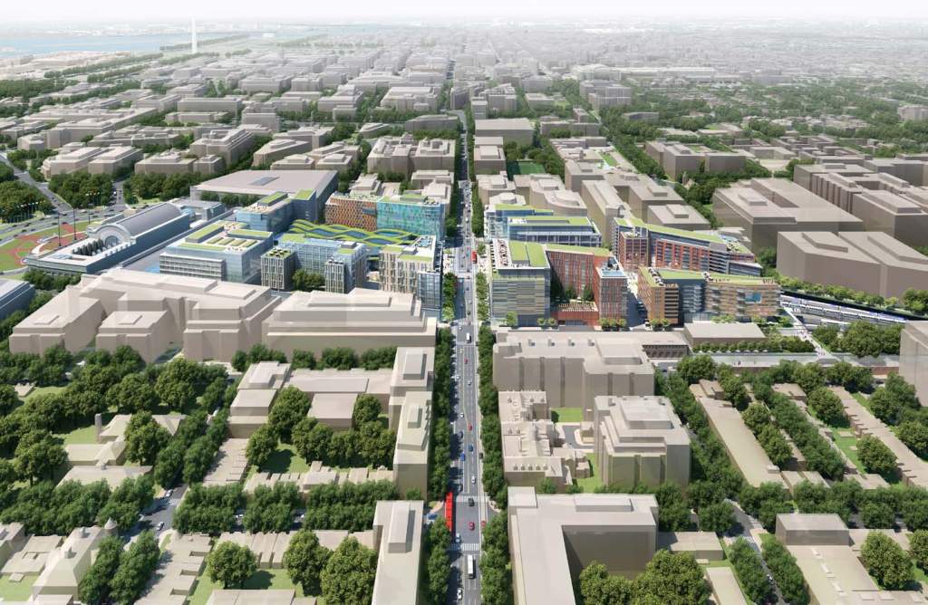
BigMediaMatt has a good tick-tock about The Logic Behind The $7 Billion Washington Union Station Renovation Proposal prepared by Parsons Brinckerhoff | HOK (Union Station Master Plan Executive Summary):
The plan comes essentially from the conjunction of two separate issues. One is that way back in 2002, Akridge paid a considerable amount of money for the right to build a platform over a lot of these Union Station tracks. Atop the platform will sit a bunch of buildings, as well as a reconnection of the currently disrupted street grid. That will include a renovation of the existing H Street Bridge, which is currently quite old and in need of some form of replacement.
The money for all this work is separate from the Master Plan proposal and would all come from Akridge. But once this is done, it will become practically impossible to ever move the Union Station tracks.
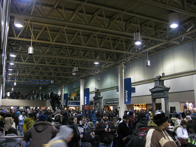
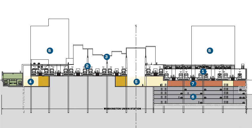
Amtrak/MARC/VRE’s contention, however, is that moving the tracks would be highly desirable. Why? Because they want to make the platforms wider. Why do they want to do that? For starters, they say the existing 18 foot platforms aren’t compliant with Americans with Disabilities Act and National Fire Protection Association guidelines for safety. New train stations are normally constructed with platforms in the 25-30 foot width range. The practical transportation capacity issue here is that the current platforms are allegedly too narrow to let passengers be getting on/off of the tracks on both sides of the platform simultaneously. Wider platforms allow for simultaneous boarding allow for greater capacity.
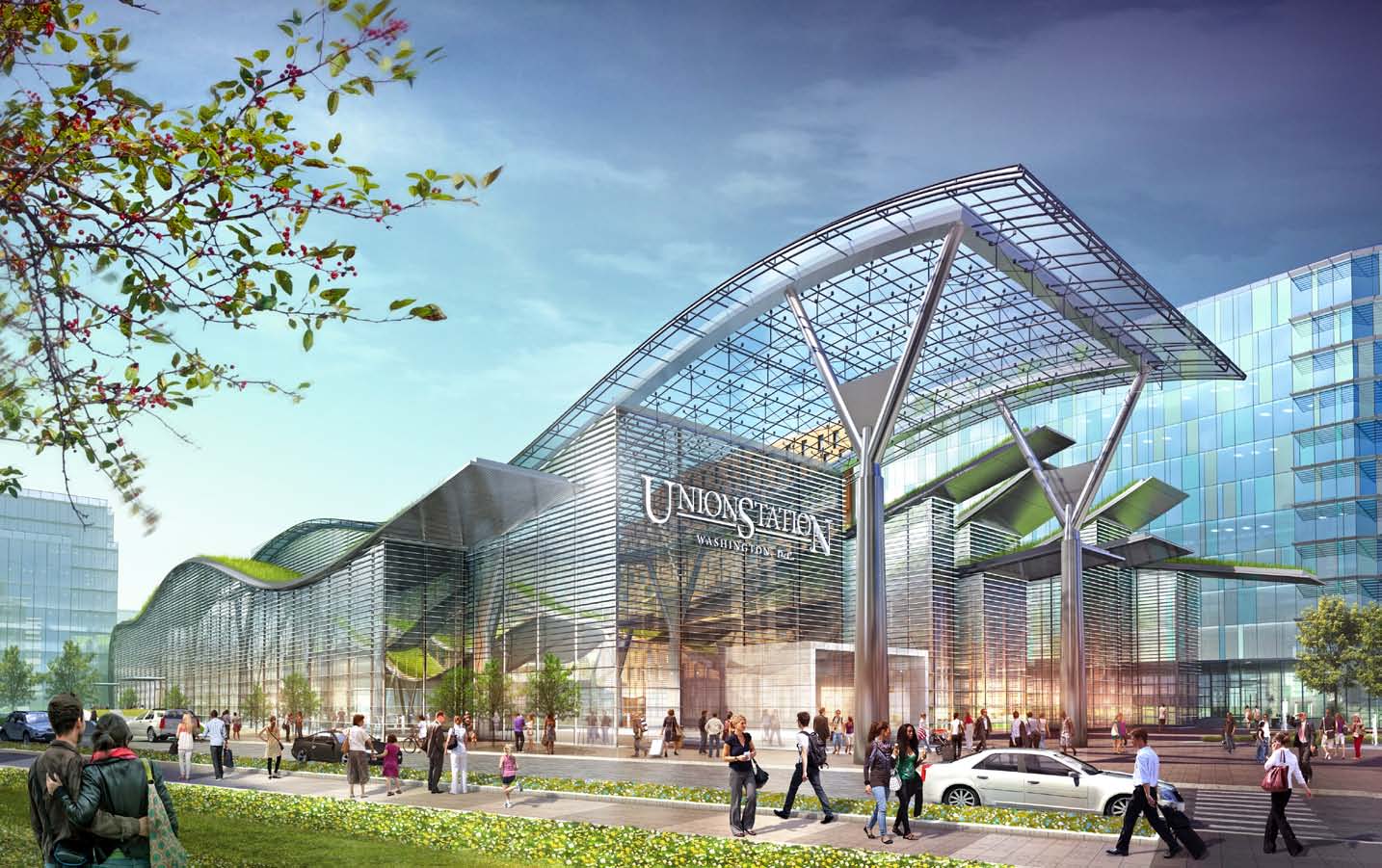
Contra to Kevin Drum, this isn’t necessarily just about widening the platforms for the Americans with Disabilities Act, which is certainly part of the project’s goals:
Queues of departing Amtrak passengers form a halfhour before boarding begins and routinely extend into the public concourse, blocking flows. Additionally, the tracks and platforms do not comply with modern design standards, including the requirements of the Americans with Disabilities Act (ADA) and the emergency egress standards of life safety codes. The mixing of train servicing activities with passengers – both concentrated at the same end of the platforms – creates circulation bottlenecks that will worsen as passenger volumes increase.
The project’s goals are to increase capacity and reconnect the station with the surrounding neighborhood. Done correctly, and you get Grand Central Terminal, poorly and you get Penn Station. The estimated $7 billion (2012 dollars) is steep for what seems to be a project designed to allow a private developer to maximize profits and to increase capacity. I don’t see why the developer can’t chip in some of the cost of the overall project, as they are the ones who will reap the single biggest reward.
The biggest problem with this project is that for $7 billion you don’t get any additional capacity and speed between city pairs (DC-Baltimore, DC-Philadelphia, DC-NYC) isn’t increased at all. If I was king, I would spend that money on upgrading the Northeast Corridor in order to increase the overall train speed, including improving regional and commuter rail. This is also the problem withe Penn Station renovation plans: they are undoubtably very pretty, but ultimately less useful than making trains go fast.



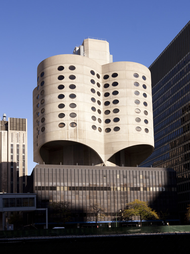
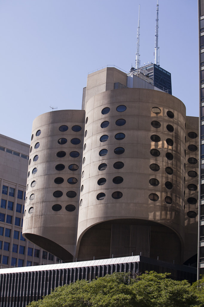
Save Prentice Women’s Hospital by Bertrand Goldberg
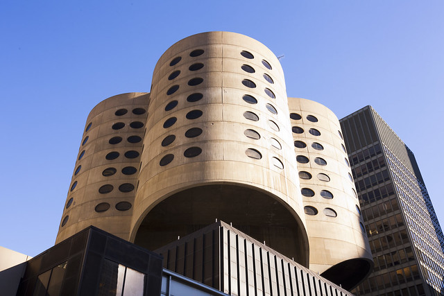
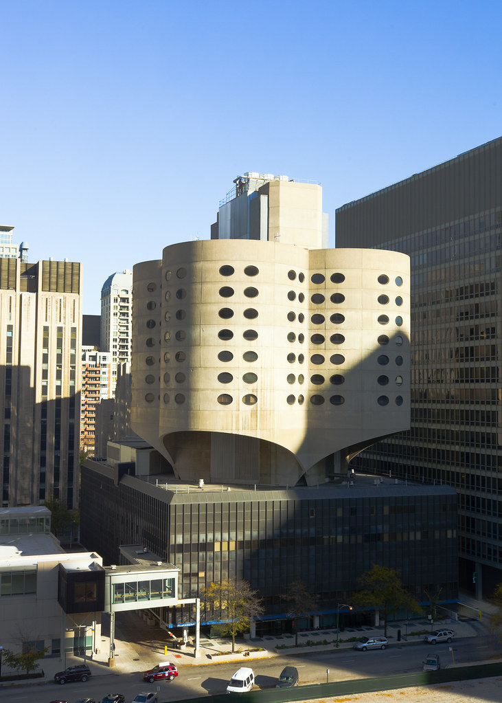
My favorite buildings in Chicago are by Bertrand Goldberg, architect of slightly eccentric buildings throughout the Windy City including the Marina City Towers, River City and Prentice Women’s Hospital on Northwestern University’s Medical Campus in the heart of Chicago. A few years ago the university moved out of the building and it has sat vacant. Northwestern University has recently made rumblings about demolishing the building to make way for a newer – and probably more bland – building. The National Trust for Historic Preservation has a Save Prentice Petition asking you to “Show Prentice Some Love.”
I don’t know if I agree with all of this, but this resonates with me:
Modernism at its best is about a process of reinvention akin to punk – a process where each generation of new architects establishes new ways of working that purposely fly in the face of the previous.
Los Angeles Metro Picks Grimshaw/Gruen team for Union Square Master Plan
As previously reported, the The Los Angeles County Metropolitan Transportation Authority (Metro) Board of Directors voted to approve a contract with Los Angeles-based Gruen Associates in association with Grimshaw Architects of London for the creation of a master plan for the historic Union Station and its surrounding 40 acres.
Metro anticipates signing the contract this summer with the goal of having the master plan completed within 18 to 24 months, or summer 2014. Gruen/Grimshaw has broughttogether a large team of specialist firms from preservation experts to sustainability and technicalconsultants to collaborate on the plan which will be adopted after an approval from the MetroBoard.
The above “vision board” – a requirement of the RFP created by six different architecture firms – shouldn’t be taken seriously, as LA Metro’s own release states that “while there will be no detailed architectural design involved with this master plan, Grimshaw is expected to bring architectural vision to the process.” Hopefully this won’t turn into another World Trade moment where the master planner is kicked off the project. I have great respect for Grimshaw and their work, and hope they can help knit the center of Los Angeles back together.

Bright Solutions from the Dark Age of Urban Planning
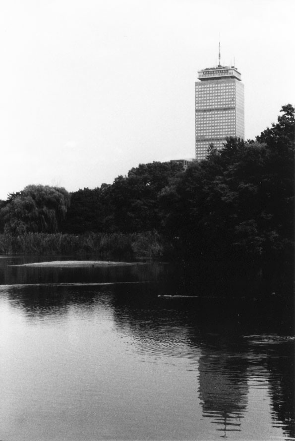
How the Prudential Center came to be – Bright Solutions from the Dark Age of Urban Planning:
Prudential, pursuing a course of corporate decentralization in the 1950s, settled on Boston as the location for its New England Regional headquarters, with plans for a signature tower. This was a bolder move than you’d expect, as Rubin’s engrossing account of the political and business climate in mid-20th-century Boston illustrates. At the time the tallest building in New England was in Hartford.
Ohio Statehouse 1853
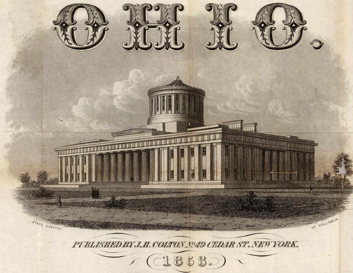
From David Rumsey Historical Map Collection: Colton’s Railroad & Township Map of the State of Ohio. Published By J.H. Colton No. 49 Cedar St. New York. 1853. Entered … 1851 by J.H. Colton … New York. Drawn by George W. Colton. Engraved by J.M. Atwood, New York.
