Call it the Parallel World paradigm.
Certain advantages come with PW. For one thing, the architectural inconsistencies between the house we see on the outside and the one we see on the inside are all explained at a single stroke. When the lightning flashes in the garrett of the stretching room, we see the site of the Ghost Host’s suicide, but what we see doesn’t match the outside cupola very well. That’s because it’s a glimpse of the old house. But other than this one early glimpse, you’re still in the house you saw from the outside until you get to the limbo area, where we board our buggies (we are, as usual, following the Disneyland model). There, a transition takes place, which explains, I suppose, why we need something like a limbo area. From that point forward we see the original house, the house as the ghosts see it.
Category: Architecture
The Brooklyn Nets

So, looks like no one likes the Brooklyn Nets new logo:
Whether Jay Z opened up Adobe Illustrator and set the type on a curve himself or not remains a mystery but one thing is for sure: the logo family is technically worthless and embarrassing. The “NETS” typography on the primary logo is conceptually uninspired — if the identity is meant to convey Subway signage, where is the bold Helvetica? — and visually unbalanced with a shift in thicks and thins that is neither obvious enough to look like a Humanist sans nor non-existent where it would be a Geometric sans. My design bullshit-o-meter thinks that it might just be an horizontally scaled version of Akzidenz Grotesk Condensed, which makes an appearance in “BROOKLYN” in the primary logo and the “B” inside the basketball, which has its own kind of thick and thin lines that bear no resemblance to the type or the strokes in any of the logo versions.
Sure, the “NETS” typography is childish and inelegant. But overall I like the simplicity – the logo does look like it has been around for some time; hoever, the logo might very well be the Camden Yards of logo design, trading on nostalgia to connote timelessness.
 Atlantic Yards old design by Frank Gehry
But I have to point out that this wrong:
But I’ve been very, very opposed to the new arena (about nine blocks from where I live) and its associated development project. It’s in a terrible location that will bring loads of traffic and congestion to a spot that’s already overburdened, it’s a financial boondoggle, it has forced people out of their homes, it’s not providing as many jobs as had been promised (happy May Day!), and on and on. It’s a fucking disaster, and I get sick to my stomach just thinking about it.
(emphasis added)
I have to admit that I support building big in Atlantic Yards, just not the way it has been proposed in the last 6 years. The problem is that the process which the City and State undertook to develop Atlantic Yards has so poisoned the civic well that any discussion of Atlantic Yards is beyond acrimonious. Look at the above bolded quote: are you kidding me? Is there not a place in New York City which is geared to mixed-use Transit Oriented Development then Atlantic Yards, a parcel of land which sits over nine subway lines and a Long Island Railroad terminal? I support a dense and urban place making at Atlantic Yards – plus an arena, as long as the can generate enough activity so it isn’t a black hole in the urban fabric.
The new SHoP-designed Barclays Center is fine enough, but my main issue is the lack of storefront-retail along the street which will certainly turn this block into a dead-zone when there are no events in the arena. Street-front retail is wholly consistent with the needs and function of an arena, and is financially smart: if you structure the deal right you not only receive monthly rent but you can receive a percent of sales, increasing the productivity of the overall arena. If the developer decided against this, then they weren’t working hard enough.

My main arguments against this development of Atlantic Yards deal with process and maximizing taxpayer’s revenue.
First off, the MTA sold the air rights to Forest City Ratner for a horribly low amount:
Ratner agreed to pay $100 million to acquire air rights to build over the trench between Atlantic Avenue and Pacific Street. But pleading hardship due to the global credit crunch, Ratner is looking to pay perhaps as little as $20 million up front and to spread the remainder out of over years.
And the MTA appears to be on board.
This is money coming out of our pockets.
Second, I agree with anti-Atlantic Yards activists that the city and State of New York have worked overtime on making every decision as concealed and hidden from public view and oversight. The State won’t even publicize how many parking spots they will build. Land is a public resource, especially expensive land in a dense metropolis of NYC, and the lack of public oversight is astonishing, even for New York City.

Which brings me to my third objection: There should be no surface parking, and any garage parking on this site should horribly expensive parking discouraging fans from driving. Knicks fans – the ones which are left at any rate – have no problem taking the LIRR or subway to the Garden. Furthermore, Atlantic Yards is a textbook example of where you should build taller, and denser developments because it is one of the few areas in the city which combines so many transit points in one area. Atlantic Yards could have become the next Grand Central Terminal surrounded by a dense zone of commercial buildings and housing. Great care needed to be taken to make sure that the surrounding blocks would not be overwhelmed, but this was an opportunity to create a mix of retail, commercial, low-, mid-, and high-end housing which could have added much needed revenue to the City and State. not to mention much needed housing to a city with outrageous housing costs.
But this didn’t happen. Instead of a consensus-driven rezoning of the area around Atlantic Yards which would have benefited the city and residents, a process which (while acrimonious) worked on the Greenpoint-Williamsburg Waterfront Rezoning, the State and the City bent over backwards to almost literally give away a precious amount of real estate to powerfully entrenched group. I’m not angry at Forest City Ratner – that’s their job to develop and build. It is our duly-elected representatives who are entrusted with guarding the public good who are the most at fault here: George Pataki, Eliot Spitzer, and David Paterson, and Mayor Michael Bloomberg.
What I’m most appalled at is the ferver of using expedient shortcuts to accomplish what was politically and socially dubious; the use of eminent domain to take possession of land within the arena footprint by the state and given to a private developer should give us all pause. In this case there was no greater good which came out of this transaction. The State decided that shortcuts and back room deals was key to moving this project along. This part of the city, much like around The Garden, will reap the whirlwind for poor choices driven primarily by greed and laziness for quite a long time forward.
My Own Piece of Dirt
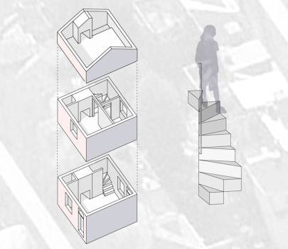
Some of America’s first urban workers lived in a unique type of Philadelphia home called a Trinity. Examples date from 1720. Trinities were built to house the artisan classes flocking to a burgeoning city; but while these workers moved on to populate America, the Trinity House didn’t follow them. But the Trinity and the narrow streets that contain them warrant a closer look.
A Trinity, as the name suggests, consists of three rooms stacked on top of each other – and that makes the whole house. A Betsy Ross stair punches through, basically an elongated spiral stair that is so narrow and steep that, instead of a railing for balance, you haul yourself up using a vertically mounted steel bracket.
via My Own Piece of Dirt | Metropolis POV | Metropolis Magazine.
The Death and Life of Detroit
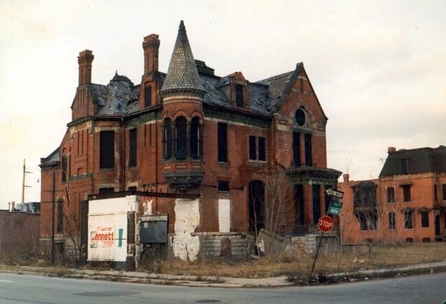
This is a more intimate Detroit than I—than most of us—have consumed in the media. Detroit takes up an outsize space in the American psyche, with Eminem and Clint Eastwood proclaiming the auto industry’s resurgence in dewy Super Bowl ads; with glowing recovery stories pairing the words “Midtown” and “hipster”; with apocalyptic (and accurate) images of Dresden-like streets; and with a millionaire mayor touting the most ambitious plan in modern history to reshape a U.S. city. Viewing it through those media lenses is like peering through a kaleidoscope or maybe at a Rorschach test: A city in recovery. A city in free fall. It depends on who’s telling the story.
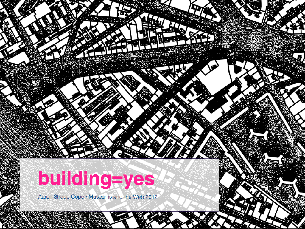
Being present on the network: buildings=yes presentation by Aaron Straup Cope
The second paper I presented was about the building=yes project. It is very much a technical paper going over the nuts and bolts of extracting the data (from OpenStreetMap), indexing it and designing custom map tiles to help make sense of the sheer volume of data. Rather than try to cram all that information in to a 15 minute talk I instead talked about the overall value – the purpose – of creating these kinds of registries and tried to highlight the importance of being patient. It’s not always clear what will come out of these kinds of projects but what is clear is that stable, linkable things that can hold hands with one another are the foundation on which all the interesting stuff will be built.
Survey of tallest Buildings in New York City

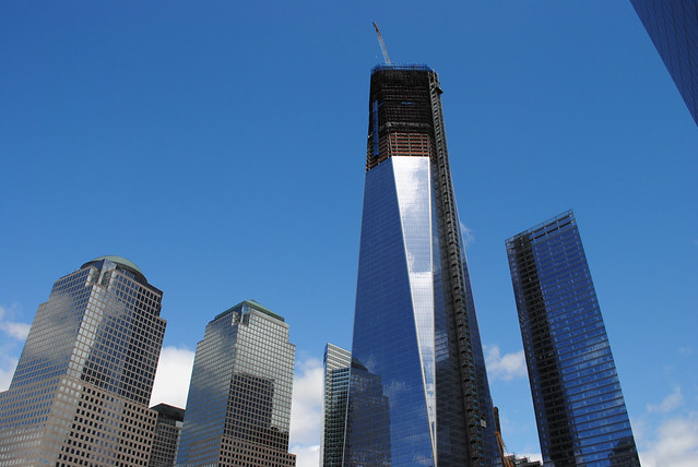
1 World Trade Center Will Reclaim the Sky in Lower Manhattan:
If the winds are forgiving enough over Lower Manhattan — up where workers can see the whole outline of the island’s tip — a steel column will be hoisted into place Monday afternoon atop the exoskeleton of 1 World Trade Center and New York will have a new tallest building.
More important, downtown will have reclaimed its pole star.
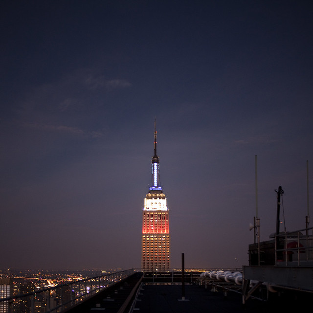
Poking into the sky, the first column of the 100th floor of 1 World Trade Center will bring the tower to a height of 1,271 feet, making it 21 feet higher than the Empire State Building.
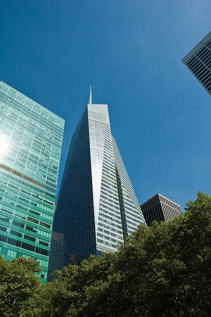
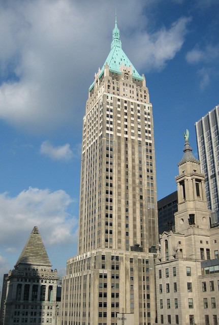
Below is a selection of the five tallest buildings in New York City.
1 World Trade Center
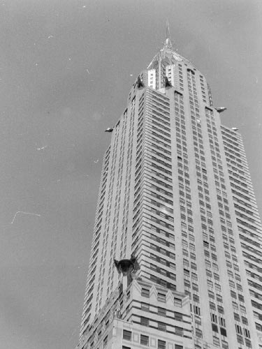
Chrysler Building – May 27, 1930
Michigan Central Station
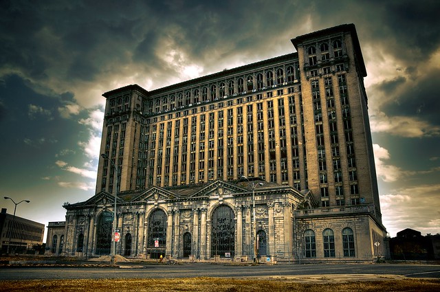
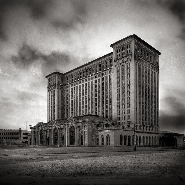
Built in 1913 for the Michigan Central Railroad, Michigan Central Station (also known as Michigan Central Depot or MCS), was Detroit’s passenger rail depot from its opening in 1913, until the cessation of Amtrak service on January 6, 1988. At the time of its construction, it was the tallest rail station in the world.
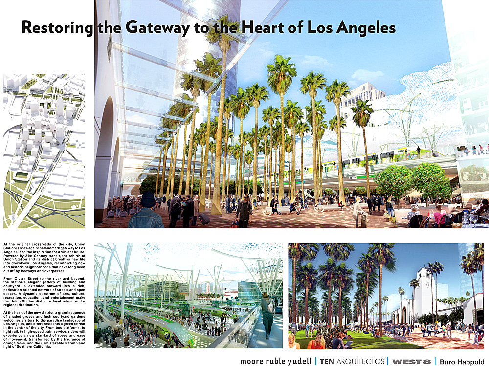
Los Angeles Union Station Master Plan “Vision Boards”

In April 2011, Metro completed the acquisition of Union Station and the approximately 40 acres surrounding the historic rail passenger terminal. As part of the Los Angeles Union Station Master Plan, the six short-listed teams were required to submit one Vision Board showing a high-concept vision for Union Station in the year 2050. The Vision Boards are not part of the formal evaluation process, but rather a means to begin the public engagement process and ignite inspiration about Union Station as a multi-modal regional transportation hub. The Vision Boards were presented to the public at a viewing event on April 25th, 2012.
The short listed teams all include multiple firms, and are led by the following prime contractors:
- EE&K a Perkins Eastman Company/UNStudio
- Gruen Associates/Grimshaw Architects
- IBI Group/Foster+Partners
- Moore Ruble Yudell Architect and Planners/Ten Aquitectos/West 8
- NBBJ/ingenhoven Architects
- Renzo Piano Building Workshop (RPBW)/ Parsons Transportation Group
All six teams are required to do the following during the master planning phase:
- Data Collection and Analysis
- Preparation of Draft Alternatives
- Final Preferred Plan and Implementation Strategies
- Public Outreach (throughout the process)
- Project Administration (throughout the process)
Metro is in the evaluation process and will bring a recommendation for the USMP consultant team to the Board of Directors on June 28th, 2012 with public announcement on or around June 17th.
Below are the Vision Boards:


