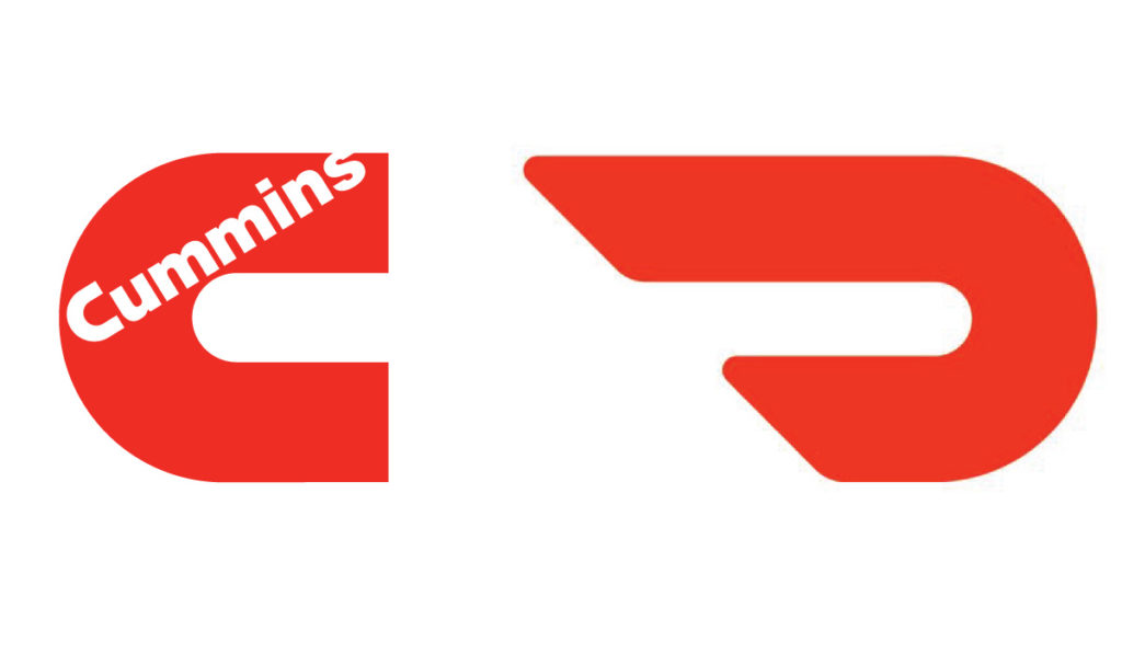
The Door Dash logo (by Character) looks like a reflected Cummins Diesel logo by Paul Rand. Makes me think that they just saw Rand’s logo, flipped it and elongated it.
Gawker Media – publishers of Gawker, Jezebel, and a host of other blogs – has an awesome “big data” Big Board which is available online and also installed in their office (above). Nick Denton has always been obsessed with metrics, and I applaud this level of introspection. The Big Board tracks the usual metrics, but also has other intriguing stats they are interested in:
Also interesting: the Big Board isn’t optimized for mobile viewing (at least on my iPhone 4s). I would assume that this will change soon.
OpenPlans, a company which builds open source civic infrastructure, collaborating with the public sector to create technology for more efficient, responsive, and inclusive government, has launched a kickstarter drive to create a Transit App for iOS 6 and Beyond:
With the announcement of iOS version 6, Apple has dropped Google Maps and with it, previously built-in support for travel directions via public transit.
With your support, OpenTripPlanner Mobile, an open source application developed by OpenPlans will put transit back on the iPhone. Initially, we will offer coverage for almost all transit systems in North America (see coverage details below).
The app will also add new features that Google Maps didn’t have, allowing users to combine walking, bikes, bike-share and transit together, finding the fastest and most efficient trips regardless of mode of transportation.

Transit App will is now supporting any transit agency in North America that provides open data in the GTFS format. Hundreds of transit agencies already offer this data – check out the current coverage map.
The Chicago Neighborhoods, a project by Steve Shanabruch to brand the many different neighborhoods in Chicago:
I know branding a neighborhood is quite subjective. My experiences and knowledge are obviously different than those of someone else, especially a long-time resident, so let’s call this project “One designer’s take on Chicago.” My vision might not match yours, but I hope that we can agree that a neighborhood with a logo is better than a neighborhood without.
Check out this excellent Raja Dinkar Kelkar Museum identity redesign by Maseeh Ali Khan.
The Raja Dinkar Kelkar Museum is a one-man collection of Padmashree Late Dr. D.G. Kelkar (1896 – 1990). The museum is situated in the heart of Pune and has a collection of about 21,000 priceless artifacts, spread over an area of three floors. Upon my visit to the museum, I identified a scope of improvement within the internal communication media used such as signages, artifact descriptions and maps to guide you through. Hence, this whole new system was designed with a new visual language, identity and guidelines.
![]()
Just another accident during project crunch-time.

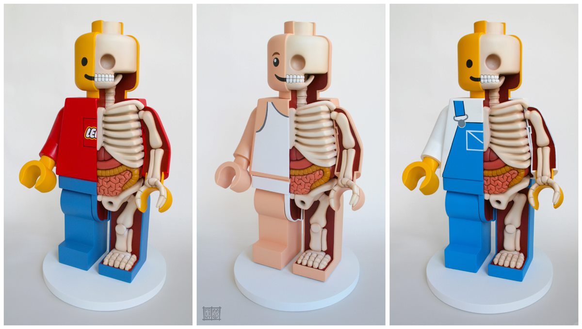
It must be LEGO day here: Jason Freeny‘s LEGO minifig dissected sculptures (process photos) are amazing. Check out his other anatomical sculptures .
InterCityAPT, a photo by Mayo Nissen on Flickr.