Noisy Jelly

DSC_4722

Make your own jelly instruments by Raphaël Pluvinage and Marianne Cauvard:

Noisy jelly is a game where the player has to cook and shape his own musical material, based on coloured jelly.

With this noisy chemistry lab, the gamer will create his own jelly with water and a few grams of agar agar powder. After added different color, the mix is then pour in the molds. 10 min later, the jelly shape can then be placed on the game board,and by touching the shape, the gamer will activate different sounds.
Technically, the game board is a capacitive sensor, and the variations of the shape and their salt concentration, the distance and the strength of the finger contact are detected and transform into an audio signal.

This object aims to demonstrate that electronic can have a new aesthetic, and be envisaged as a malleable material, which has to be manipulated and experimented.

DSC_4741

Technical explanation

DSC_4737

DSC_4752

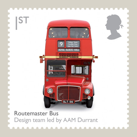
British Design Classics stamps by Royal Mail

How did I miss this? In 2009 the UK Royal Mail issued a set of eight British Design Classics stamps featuring excellent photography by Jason Tozer. I wouldn’t mind having these set of stampe, or really all ten of these items in my possession.

On New York Subway Map’s Compounding Travesty

Pedestrians on Broadway in this area can stumble upon an Ivy League university or gaze through the windows of Tom’s Restaurant, of “Seinfeld” fame. They can find a copy of “Pride and Prejudice” for $2 at a stand on West 112th Street, and, four blocks south, a taco for 50 cents more. They can even sip mojitos at Havana Central at the West End, near West 114th Street.

But they will never find West End Avenue between Broadway and Riverside Drive.

Mr. Tauranac, who has for years assailed Mr. Vignelli for such inaccuracies as having Bowling Green north of Rector Street, said the revelations had forced him to re-evaluate his harsh judgments of Mr. Vignelli, 81. “It really has dulled my attack, that’s for sure,” Mr. Tauranac said.

Moments later, he retrieved from his office the May 2008 copy of Men’s Vogue, featuring an updated Vignelli map “every bit as terrible a map as he designed in 1972,” to Mr. Tauranac’s eye.

“I’m happy to see that he’s mellowing,” Mr. Vignelli said.

via On New York Subway Map, a Wayward Broadway and Phantom Blocks – NYTimes.com.

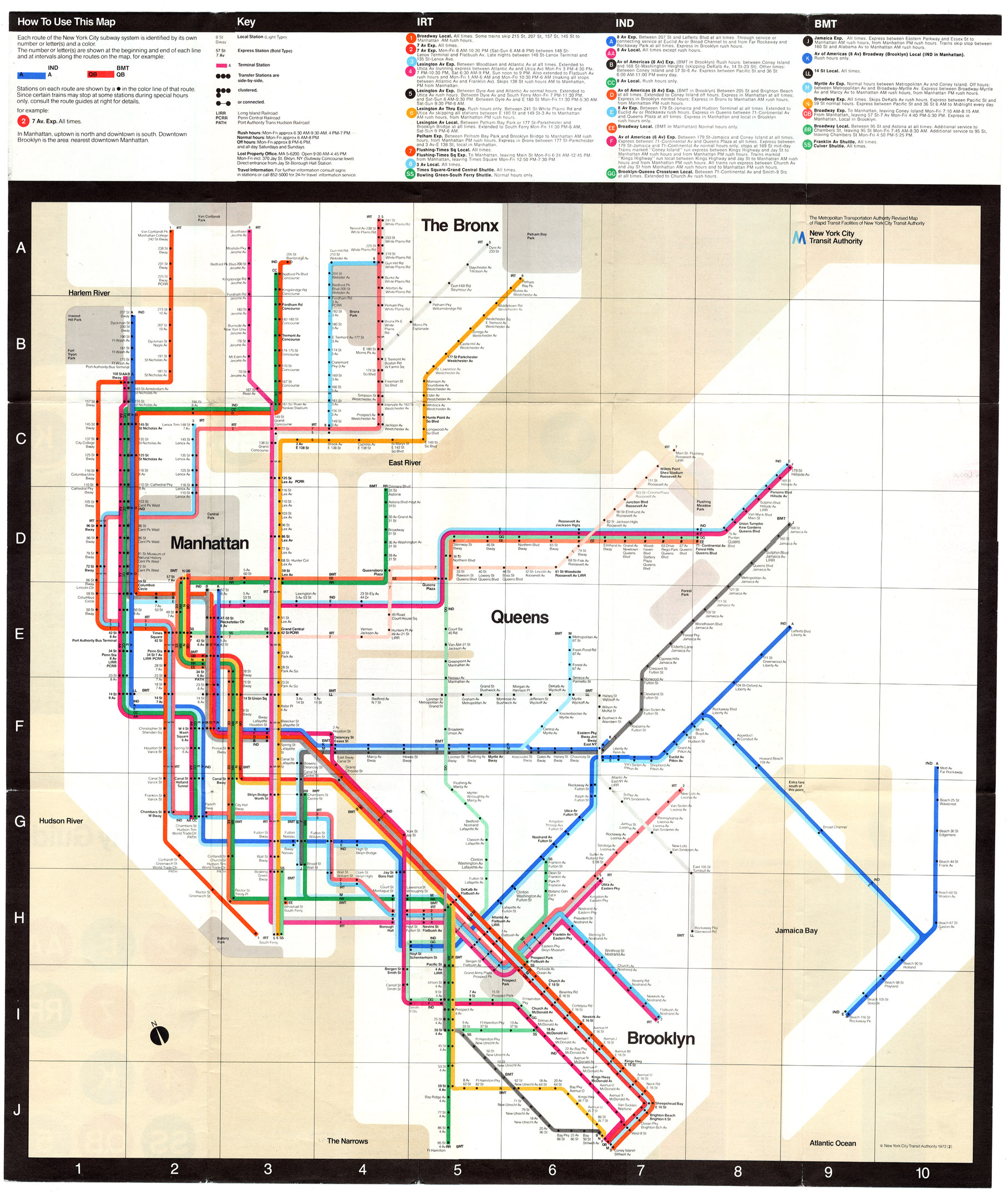
The current map is an abomination of design, the revelation of more mistakes just compounds the existing travesty. Not that Vignell’s 1972 map is any better with oversimplification, a precious use of color and lines rendering it more art piece than functional map or diagram.

Vignelli 1972 Map

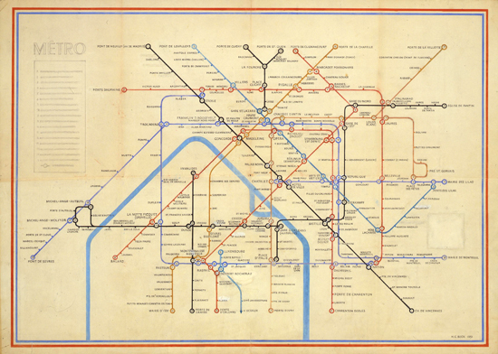
It seems every designer is trying to reinvent Harry Beck’s amazing diagram for both the Paris Metro and the London Underground:

The problem being that Beck’s Underground Map is uniquely suited to London’s system, not New York City subway’s combination of express/local lines, geography and history of being composed of three different subway companies.

See also

Against Chairs

KeepItLight_Week5_Eames_Era

I hate to piss on the party, but chairs suck. All of them. No designer has ever made a good chair, because it is impossible. Some are better than others, but all are bad.  Not only are chairs a health hazard, they also have a problematic history that has inextricably tied them to our culture of status-obsessed individualism. Worse still, we’ve become dependent on them and it’s not clear that we’ll ever be free.

via Against Chairs.

The Metrocard Project

The Metrocard Project

The Metrocard Project is an ongoing project that aims to redesign the iconic New York City Metrocard in a fresh way. The project was created by Melanie Chernock, a graphic designer studying at the School of Visual Arts.

The Metrocard Project.

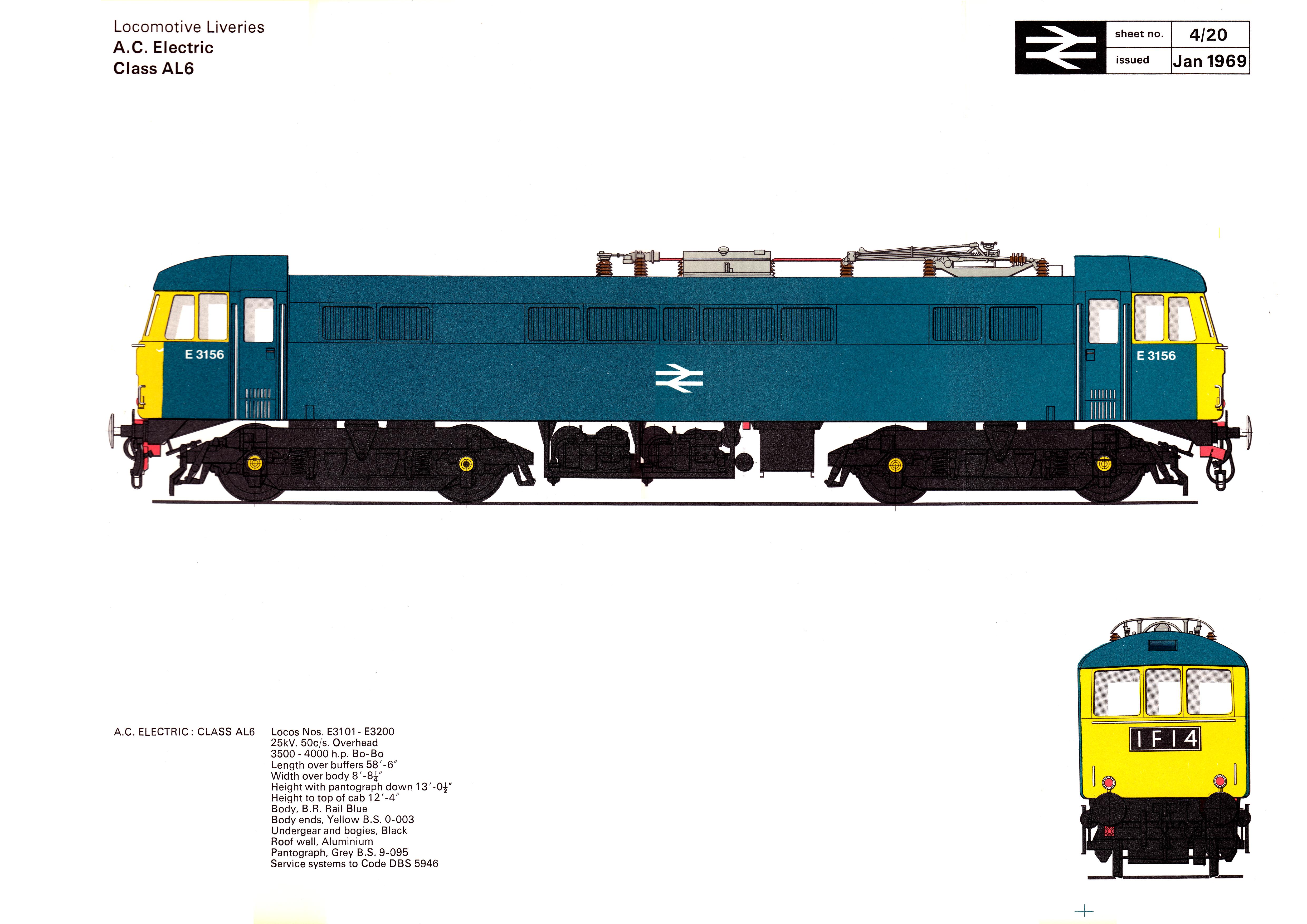
British Rail Corporate Identity, 1965-1994

HST Diesel electric power car Class 253

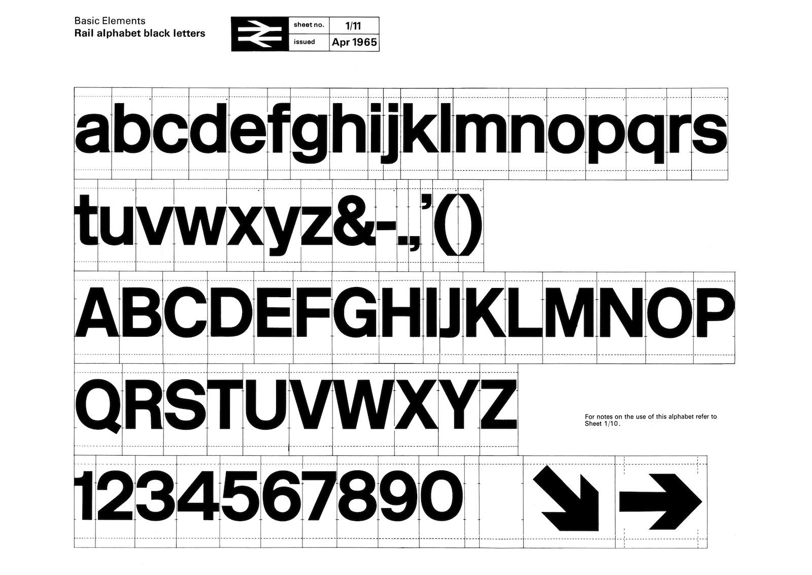
In 1964 the Design Research Unit—Britain’s first multi-disciplinary design agency founded in 1943 by Misha Black, Milner Gray and Herbert Read—was commissioned to breathe new life into the nation’s neglected railway industry, the corporate image of which had remained largely unchanged after its nationalisation in 1948, a reflection of a largely disjointed and out-of-date transport system. The company name was shortened to British Rail and Gerry Barney of the Design Rearch Unit conceived the famous ‘double-arrow’, a remarkably robust and memorable icon that has far outlasted British Rail itself and continues to be used on traffic signs throughout the United Kingdom as the symbol for the national rail network and more specifically railway stations on that network. The new corporate identity programme was launched in January 1965 with an exhibition at the Design Council, London. The corporate identity consisted of four basic elements: the new symbol, the British Rail logotype, the Rail Alphabet typeface and the house colours.

British Rail Corporate Identity from 1965–1994

How Veronika Scott uses Steelcase’s discarded fabric to help Detroit’s homeless

The Empowerment Plan

Veronika Scott, a 22-year-old designer, is credited with saving lives with the invention of “Element S Coat,” a self-heated and waterproof coat that transforms into a sleeping bag at night. The coats have been distributed for free to 22,000 homeless Detroit residents through her organization The Empowerment Plan.

Late last fall, Scott began working with Steelcase Inc. to obtain discarded fabric to use as lining for her coats made of Tyvek and wool. So far, the Kentwood office furniture maker has provided 6,000 yards – the equivalent of 3.5 miles.

MPWR Coat

Untitled

Read more at How a 22-year-old designer uses Steelcase’s discarded fabric to help Detroit’s homeless and watch the TEDx talk below.