The design of a signage typeface

Direction Sign, Spain

The story begins in 2006 with a trip down Route 66. Day in, day out, I looked at U.S. traffic signs that were either set in the old, somewhat clumsy “FHWA font series” or the new Clearview HWY typeface. Approaching the signs, I would often test myself: which typeface works best from a distance, and which of its features or details might be responsible for its performance.

Read more at The design of a signage typeface Wayfinding Sans and see a Flickr collection of World of Traffic Signs and group Type on Traffic Signs.

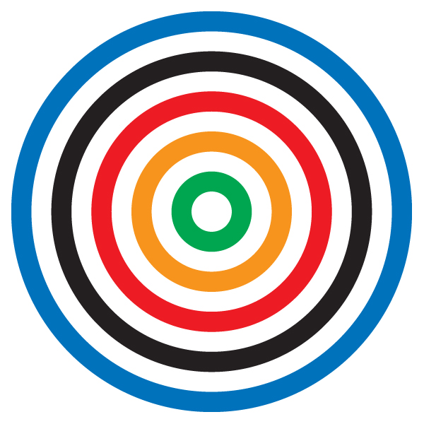
Alternative London 2012 Olympics Logo

Daniel Eatock Alt. Olympic 2012 Logo

Alternative Olympic 2012 Logos by Daniel Eatock. Both alternative logos are a composite of two icons: the Olympic Rings, created in 1913 by Pierre de Coubertin and the RAF Roundel, associated with British pop art of the 1960s, appearing in paintings by Jasper Johns and Peter Blake.

The first alternative logo features equal sized rings and the second alternative logo features the five colored rings and the white space that separates them all with the same surface area.

Honest Labeling, by Karim Rashid

Karim Rashid

Really?

Karim Rashid Inc is an award winning design firm specializing in product design, interior architecture, branding / graphic design, art exhibitions, fashion, among others.

We are looking for an Interior Designer, with a minimum of eight years experience and a sincere passion for Karim’s vision, to join our team.

(emphasis added)