Photo removed at request of author
But please go and see the photo, Asian Manhattan, originally uploaded by Lo M.
But please go and see the photo, Asian Manhattan, originally uploaded by Lo M.
 Fantasy architecture sketch, originally uploaded by Pergamon
Speaking of Piranesi, check out this Fantasy architecture sketch and the whole architecture rendering set (also check out the evolving mystic architecture set).
 WE LOVE TO BUILD™, originally uploaded by chezrump
Interesting project:
This image is a rough sketch / concept, as part of my “WE LOVE TO BUILD” works. The idea will be to drop numerous geometric, concrete structures into various ambient, rural landscapes in an attempt to create an intimate and complementary relationship between that which is entirely natural and that which is man made.
The landscape in this particular shot doesn’t actually exist. It was generated by cloning rather small portions of several poor shots i snapped whilst in Nortumberland. The concrete structure was then created from scratch using various concrete textures I grabbed from within a building site. It is then a case of splicing the two together using PS.
Check out the project page to date. There is something vaguely Piranesi (see below) about Paul Hollingworth’s work.

 Philly SHPEsteak, originally uploaded by sergelui88
I’m in Philly today for work, so there will be light posting.
 amsterdam, residenze per anziani, originally uploaded by Arkfinder
Anyone want to take bets on how long A&E’s series Flip This House stays on the air? Over/under 3 months? Any takers?
A corollary, but safe bet, is when this show will be renamed Foreclose This House
; I guess the producers would need a whole new cast with a markedly different skill set when that happens.

See all of the City Income Donuts by Bill Rankin, 2006.
 Kawara, originally uploaded by SHSH
My love of typography and letters brings me often to two different, but complementary artists: On Kawara and Jenny Holzer. While both artists use type and form to create beautiful works of art, the comparisons end there. Kawara’s Today series feature a stark hand-lettered date on a solid field; a date with no context. Whereas Holzer’s work (below) is a self-contained phrase or assemblage which can stand alone – almost monadic.

That is why experiments in this realm are so exciting. Especially when you look at work in either a Structuralist or Post-Structuralist manner. In other words, the meaning and the text are do distinct, but rather coupled and viewed through such lenses as culture, education, context, etc.
A few years ago a group called the “Salute the Rough Guys” were plastering signs throughout New York City with witty slogans set in beautiful type. Most of the posters were decrying the current (circa 2006) art scene as shallow and over-hyped.

Another great recent example of typographical art is Jenny Beorkrem’s posters of city neighborhoods from San Francisco to Brooklyn. There is such a great demand of her work that many of the silkscreen versions are sold out. The work captures a snapshot of neighborhood names (which often mutate) on landforms which are often unchanging.

While Beorkrem’s and Kawara’s work are both analogous by connecting their work to specific contexts, only Beorkrem’s is the work which is explicitly connected to place, time, and a discreet context. The dialectic from context to monad could be represented as:
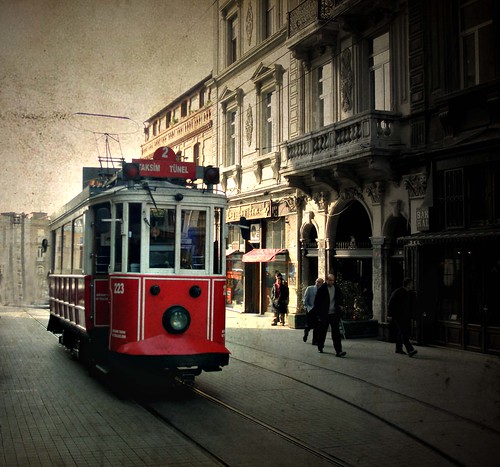
 Beyoğlu, originally uploaded by Atilla1000