Separated At Birth?

This post appeared in a previous blog and is here for posterity’s sake.

At what point do designers start recycling themselves, or take their iconoclastic style to the breaking point? How do you break out of a style, like Frank Gehry or Richard Meier, when clients come to you for the next Guggenheim or Getty Center? Or conversely, what happens when you become a chameleon flirting with styles from year to year? Philip Johnson quipped that, “After 50 years, you shouldn’t do the same thing,” but there seems to be a fine line between steady refinement and abject oscillation.

Case in point: Pritzker winner Zaha Hadid is world-renowned for her idiocentric style and design sense, and yet there are distinctly similar motif’s in the following projects; first the Centre for Contemporary Arts, Rome begun in 2003 and the Dancing Towers in Dubai, a mixed-use series of three towers combining a hotel, speculative office space, and residential space.

It is superficially easy to say that the Dubai project is merely the Rome project turned 90 degrees. It is hard not to pass judgement on Hadid’s projects from a merely visual standpoint: her projects are so iconoclastic and surface/skin dependant that it makes superficial critique easy.

Sukkah, Sukkots, Sukkot

This post appeared in a previous blog and is here for posterity’s sake.

Sukkots
Sukkots, originally uploaded by Peter Elk

Wondering what all of those shacks on the sides of buildings in Hasidic Williamsburg are? Well, they are Sukkahs which the holiday of Sukkot is celebrated; Sukkot is a 7-day holiday, with the first day celebrated as a full festival with special prayer services and holiday meals. Wikipedia says:

The word Sukkot is the plural of the Hebrew word sukkah, meaning booth or hut. During this holiday, Jews eat their meals, entertain guests, relax, and even sleep in a sukkah, a temporary structure (see below). The sukkah is reminiscent of the type of huts in which the ancient Israelites dwelt during their 40 years of wandering in the desert after the Exodus from Egypt, and reflects God’s benevolence in providing for all their needs in the desert.

In Israel (and among Reform Jews), Sukkot is a 7-day holiday, with the first day celebrated as a full festival with special prayer services and holiday meals. Outside the land of Israel, the first two days are celebrated as full festivals. The remaining days are known as Chol HaMoed (festival weekdays). The seventh day of Sukkot is called Hoshanah Rabbah and has a special observance of its own.

So there you go.

By the way, I’m told that the urban Sukkah market is quite lucrative, and just by perusing a google search of “Sukkah” finds all sorts of e-commerce supply houses for all your Sukkah needs.

Later 12-OCT-2006
From the comments, comes Sukkahs of the World, a photographic collection.

Open House New York Weekend

This post appeared in a previous blog and is here for posterity’s sake.

This weekend is the third annual Open House New York (or openhousenewyork as they have branded themselves), where over 180 sites normally closed to the public are open for tours and talks throughout this weekend (disclaimer: I’ve volunteered for the last three years for OHNY).
From past years, here is my list of sites particularly worth seeing, in no particular order:

  • Jefferson Market Library (sat 1300-1700) map photo
    Climb up the massive tower for the excellent views up and down 6th Avenue
  • High Bridge Water Tower (sat 1100-1600) map photos
    Climb up the old water tower for excellent views of the Harlem River valley and Upper Manhattan
  • The Bohen Foundation (sat 0900-1700) map
    Designed by architects LOT-EK (who have an office down the street, this art gallery/foundation uses shipping containers on rails as space dividers for dynamic gallery/office spaces. Last year the architects were on hand, no word if they will be on hand this year.
  • Little Red Lighthouse (sat/sun 1000-1300) map photos
    At what other time will you be able to visit and climb into a lighthouse in Manhattan? While you are up there, visit St. John the Divine.

So, go and visit the sites and use this as an opportunity to visit areas you have no other reason to visit.
For more information, check out the OHNY Google Maps, site listings, and site updates.
And check out Open House New York tag on Flickr.

FREITAG SHOP ZURICH

This post appeared in a previous blog and is here for posterity’s sake.

stock-in-01
stock-in-01, originally uploaded by FREITAG ®
Check out the store by Freitag in Zurich made out of recycled shipping containers (pdf):

The FREITAG SHOP ZURICH is completely built from rusty, recycled freight-containers. Lovingly they were gutted, reinforced, piled up and secured. Zurich’s first bonsai-skyscraper: Low enough not to violate the city’s restriction on high-rise buildings. High enough to send shivers down anyone’s spine.

Constructed out of 17 shipping containers, this is the first container project which actually make sense; Freitag’s main product is taking recycled vinyl truck wrappers and turning them into bags, so using recycled shipping containers as a module is fitting.
FREITAG Shop Zürich - pile-up 50
And they have a Flickr account: here are <a href="http://www.flickr.com/photos/fredag/sets/72157594143794733/"Construction Photos, pilling photos, and Stocking Photos.

Beautiful Minds: A Voyage Into the Brain

This post appeared in a previous blog and is here for posterity’s sake.

Check out this YouTube video, shamelessly ripped off from Wisconsin Medical Society concerning Stephen Wiltshire:

As a child, Stephen was mute and did not relate to other human beings. Aged three, he was diagnosed as autistic. He had no language, uncontrolled tantrums and lived entirely in his own world.
At the age of five, Stephen was sent to Queensmill School in London, a school for children with special needs, where it was noticed that the only pastime he enjoyed was drawing. It soon became apparent he communicated with the world through the language of drawing; first animals, then London buses, and finally buildings. These drawings show a masterful perspective, a whimsical line and reveal a natural innate artistry.
Aged eight, Stephen started drawing cityscapes after the effects of an earthquake (all imaginary) as a result of being shown photographs of earthquakes in a book at school. He also became obsessed with cars and illustrations of cars at this time (his knowledge of them is encyclopaedic) and he drew most of the major London landmarks.

I believe I posted about him before, but check out this video to see his amazing abilities:

You can buy his drawings and books on his website.

Maps as Avatars of the City

This post appeared in a previous blog and is here for posterity’s sake.

20060907-MTA_subway_maps.jpg
Interesting story from the New York Times on The Great Subway Map Wars:

One day not long ago, in a sunlit apartment on the Upper West Side, John Tauranac could be found examining a large, taped-together draft of a subway map.
[…]
The map also did something that present-day New Yorkers take for granted. It picked out parks and islands, labeled airports, and identified neighborhoods in blue type. In other words, it showed many features of aboveground New York – just as the M.T.A. map does, with its faint street grid, its bridges, train tracks and cemeteries.
Mr. Tauranac’s latest effort is also a potent reminder that one of the stormiest battles involving New York’s self-image involved neither development nor political leadership, but what would seem the most mundane of issues: the look of the city’s subway map.

This is a story about the overreach of Modernism (as in Corbusier) and how a movement became an aesthetic. The above graphic shows three phases of the New York City Subway map, from top to bottom: Unified 1939 map, Vignelli’s 1972 map, and the present-day map (pdf). I ask a simple question: which one would you like to use each and every day?
Vignelli’s 1972 map is, contrary to prevailing thought, an atrocity. The city is not a machine. Some have commented upon the design as …a marvelous conceptual map, and it was easy to read. It was a tool for navigating the subways, although not one for navigating the city streets. I take exception to the first point, and agree with the second. Vignelli’s map is a put-on of Harry Beck’s London Tube Map which disregards London’s geography for a “rational” map. Vignelli’s map completely disregards New York’s strange historical accident of a subway system in addition to New York City’s unique geography.
Case in point: who thinks it is a good idea to have both local and express stations – the third most important piece of information after line number/letter and direction – designated by the same symbol?
This flaw is a wholly separate problem than Vignelli’s strange contortion of the landscape to fit his machine. Besides Chicago, New York City is distinctly defined by the gridiron; besides the effect on Manhattan by the Commissioner’s Plan of 1811, the grid is a huge component of Brooklyn, the Bronx and Queens, albeit in multiple overlays and intersections. One’s conception of New York City is hard to disengage from the geography. Michael Beirut makes exactly this point: …a lot of Manhattanites could tell you authoritatively how long it would take to walk from Fifth and 28th to Seventh and 44th. So the geographic discrepancies in the Vignelli map, which are no more than those you find in lots of subway maps around the world — they’re just glaring.
While the Unified 1939 map showing both subway and the extensive elevated lines is a charming but confusing failure at information presentation, it is more successful at its’ job than Vignelli’s map. And the current map (pdf) will not win design awards, it is a clear and concise diagram of the subway which lives inside the context of the city.
Clearly, today’s subway map is easier to use than previous maps. While not the spartan tabla rasa of Vignelli’s 1972 map, today’s map reflects reality and the city. Vignelli’s map is the repudiation of the messy life of urban living. However, life is not a geometrically pure existence, New York City even less so. By distilling and warping away the actual geography of the city and its’ connected vitality, Vignelli isolated the city from the people, much like Corbusier’s Ville Contemporaine (1922) which envisioned three million people living in high rise filing cabinets.
It is interesting that Vignelli’s turning away from the city is during the exact period when the city was dying and was told to Drop Dead. Urbanism was thought to be dead, and what purported to be Modernism was springing up all around New York: World Trade was going up on Radio Row, Lincoln Center invaded the middle class Upper West Side, and the Bronx was burning (read the excellent book).
While parts of the city have become Disney, and it is increasingly hard to survive in a city already a playground for the rich, I for one, am quite happy to not be living in Vignelli’s cubic wasteland.
For more information, check out NYC Subway’s historical map collection, a history of NYC Government Issued Maps, and compare New Jersey Transit’s map.

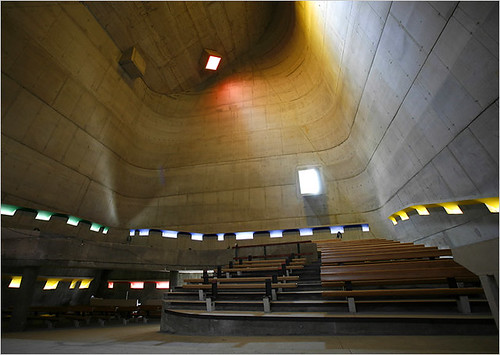
A New Le Corbusier Church?

30ouro.slide3

photo by Ed Alcock for The New York Times

A Church in France Is Almost a Triumph for Le Corbusier:

MORE than 40 years after he drowned off a remote beach in the south of France, Le Corbusier remains a transcendent force. Even if some blame him for the modern city’s greatest sins, from the steamrolling of historical neighborhoods to a stultifying emphasis on function, he is indisputably the most influential architect of the past century.

Completed by that protégé, José Oubrerie, who has tinkered with many elements of the original sketches, the Church of St. Pierre has stirred debate among Parisian academics about the ethics of finishing a work left behind by a legendary architect.
But the core of Le Corbusier’s concept remains intact: a sanctuary that distills the history of architecture from the primitive cave through Modernism. At the same time its warped planes anticipate the fluid architectural forms of today, though with a restraint that shows how so much recent work has been diluted by cheap effects.

Very nice, check out the slideshow, and all photos on Flickr and more photos of St Pierre Church, Firminy by Le Corbusier