Tube Map Variations & Homages

Harry Beck’s London Underground map is a seminal piece of design, rightly considered the map which all transport diagrams are held to. Recently the Tube Map has become the go-to diagram to remix and reinterpret a whole host of information, with Simon Patterson’s The Great Bear in 1992 kicking off a flurry of remixes shown below.

Where possible, I have included high-resolution versions as an archive. Please note: these are not the actual Tube maps which are available on the Transport for London maps page and they are not reinterpretations of the actual Tube map.

The Great Bear – Simon Patterson, 1992

The Great Bear – Simon Patterson, 1992

Tube Music – Dorian Lynskey, 2006

Tube Music – Dorian Lynskey, 2006

Royal Shakespeare Company – Kit Grover & Hester Lees-Jeffries 2007

Royal Shakespeare Company – Kit Grover & Hester Lees-Jeffries 2007
(All change at Lady Macbeth)

Underground Film Map – Film London and the BFI London Film Festival

Underground Film Map


The Underground Film Map is for sale from TfL.


On New York Subway Map’s Compounding Travesty

Pedestrians on Broadway in this area can stumble upon an Ivy League university or gaze through the windows of Tom’s Restaurant, of “Seinfeld” fame. They can find a copy of “Pride and Prejudice” for $2 at a stand on West 112th Street, and, four blocks south, a taco for 50 cents more. They can even sip mojitos at Havana Central at the West End, near West 114th Street.

But they will never find West End Avenue between Broadway and Riverside Drive.

Mr. Tauranac, who has for years assailed Mr. Vignelli for such inaccuracies as having Bowling Green north of Rector Street, said the revelations had forced him to re-evaluate his harsh judgments of Mr. Vignelli, 81. “It really has dulled my attack, that’s for sure,” Mr. Tauranac said.

Moments later, he retrieved from his office the May 2008 copy of Men’s Vogue, featuring an updated Vignelli map “every bit as terrible a map as he designed in 1972,” to Mr. Tauranac’s eye.

“I’m happy to see that he’s mellowing,” Mr. Vignelli said.

via On New York Subway Map, a Wayward Broadway and Phantom Blocks – NYTimes.com.

The current map is an abomination of design, the revelation of more mistakes just compounds the existing travesty. Not that Vignell’s 1972 map is any better with oversimplification, a precious use of color and lines rendering it more art piece than functional map or diagram.

Vignelli 1972 Map

It seems every designer is trying to reinvent Harry Beck’s amazing diagram for both the Paris Metro and the London Underground:

The problem being that Beck’s Underground Map is uniquely suited to London’s system, not New York City subway’s combination of express/local lines, geography and history of being composed of three different subway companies.

See also

Harry Beck: The Paris Connection

Detail from Harry Beck's 1951 Paris Metro map design (which was rejected by the city's transport authorities)Detail from Harry Beck’s 1951 Paris Metro map design (which was rejected by the city’s transport authorities). Source: London Transport Museum
Harry Beck: The Paris Connection:

The Royal Mail recently commem­orated one of the UK’s greatest works of visual infor­mation design when Harry Beck’s London Underground diagram was included for the first time on a British postage stamp writes Mark Ovenden. The impor­tance of Beck’s rectilinear, topologic 1933 diagram is widely recognised and praised by graphic designers. Many wonder why Beck never extended his ideas outside London. The answer is, he did – to the nearest major subway network to London: Paris.

Voice of London Underground fired for spoofs

Paint & TypographyPaint & Typography, originally uploaded by plemeljr

The woman whose voice can be heard across the Underground has been axed after recording a series of spoof messages revealing what she really thought of Tube travellers.
Emma Clarke, the voice of the Underground who has been advising people to ‘Mind the Gap’ since 1999, recorded a series of spoof messages in her trademark soft and clear style.
The professional voiceover artist lets rip at the type of people she thinks sum up the misery of Tube travel.
But now the parent company of the Tube, TfL, has made an announcement of its own, calling Ms Clarke ‘silly’ and cutting future contracts with her.

Read more and listen to the spoof announcements.
Amazing how the character of a space and place can be defined by a voice.

Accessible Transit – London Underground

For most of us just getting around the major subway systems of the world is difficult enough. What would a transit system look like if you were disabled or in a wheelchair? I became very curious in this and started to collect maps of different transit systems around the world.

London-Underground-detail

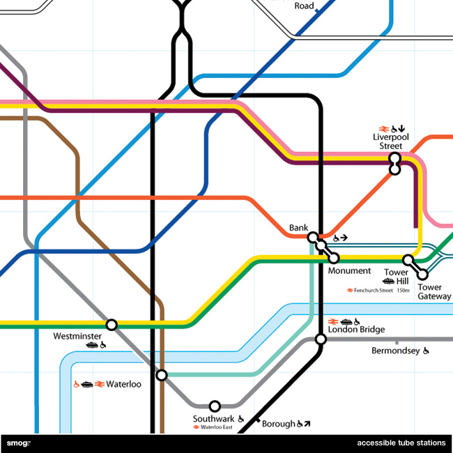
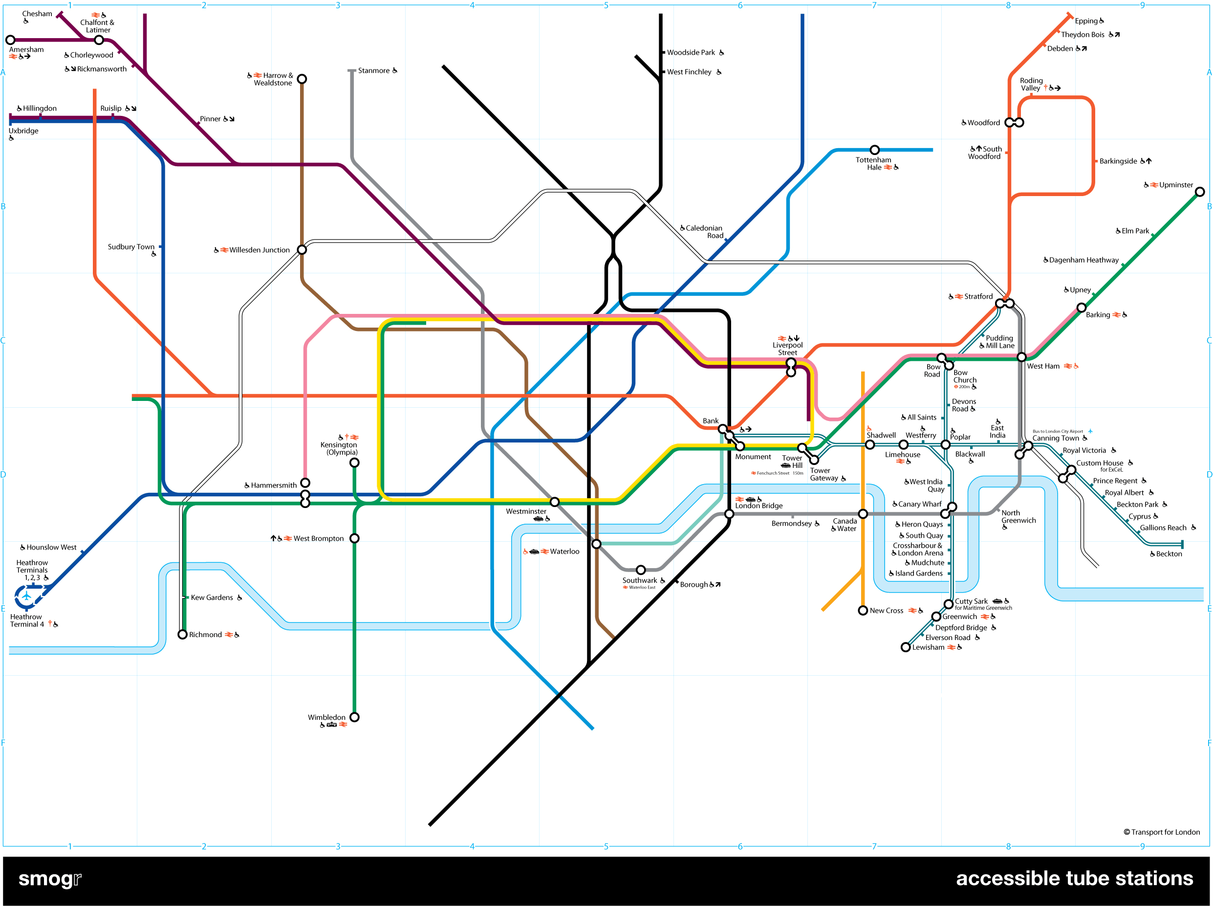
Accessible Transit – London Underground Detail

And then it occurred to me: if maps virtually represent life, through convenient fictions, then why are there no maps for those who are disabled or require additional accessibility? Wouldn’t the mother with newborn in stroller need a different map then those without the need to lug all the accoutrement’s of childhood? Equally, those in a wheelchair require a map different then one which the walking can use. I decided to rectify the situation by editing the maps of major metropolitan transportation systems, in order to create a map for those who are not represented on the official map.

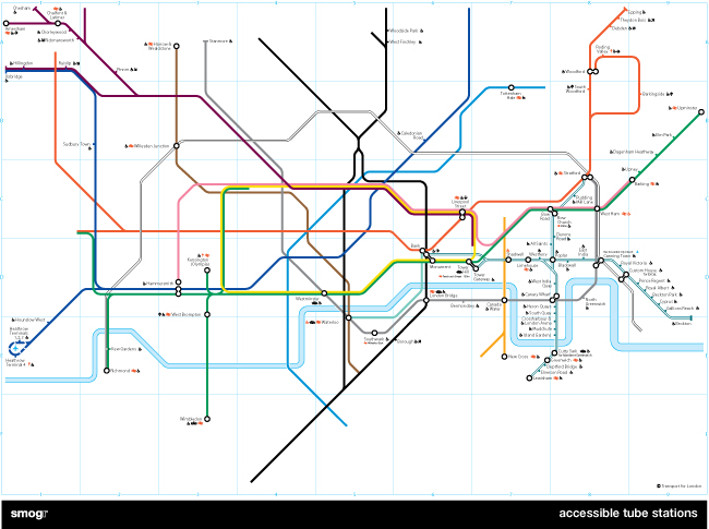
My first Accessible Transit Map was the London Underground map, which can be downloaded in the following versions:

As you can see from the detail below, those of you needing better accessibility have limited options; the DLR and the Jubilee Line are your best choices.

London-Underground-small

I realize that Transport for London has been making great strides in retrofitting many stations in order to comply with DDA requirements. TfL is doing what they can with hundreds of years old infrastructure and have an extensive transport accessibility system including Dial-a-Ride, which will pick up a disabled person and transport them. They are installing tactile warning surfaces on stairs and at the platform edge, and I’ve noticed the staff is generally helpful to those with disabilities.

But all of this doesn’t change the fact that maps have an intrinsic reality; a reality which those of us with proper ambulatory functions take for granted. Of course Transport for London won’t issue this map as an official Underground map because the map looks really, really bad (not to mention this would be really confusing for the Yank tourists). Not even half of the system’s tube stations – I count 82 out of 275 stations – are accessible.

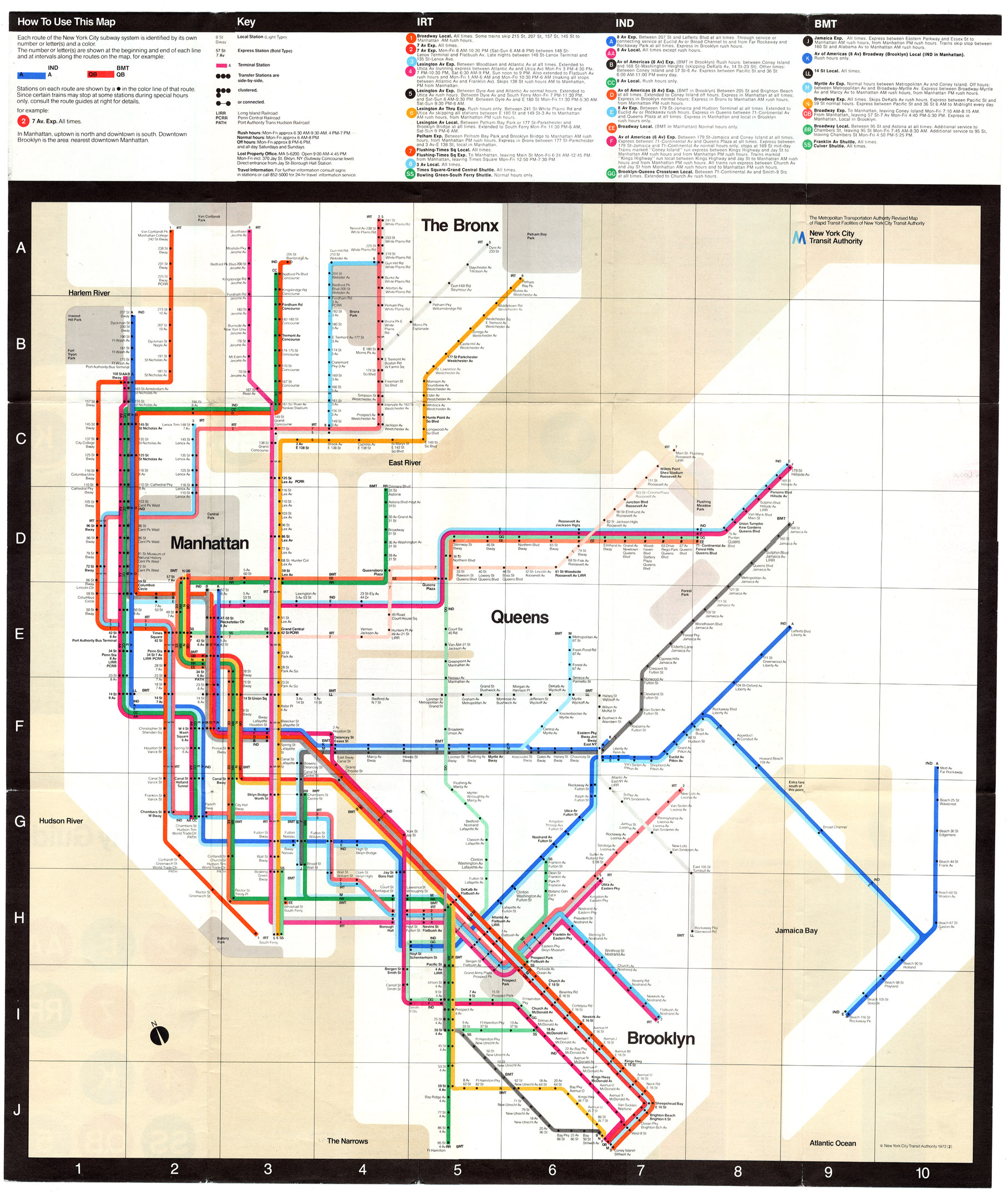
Lest my reader believes I am picking on the fair city of London, be still. The New York City Subway maps is coming soon; it took longer because the graphics file is horrendously large and difficult to work with.

London Underground Map formatted for iPhone

20070827-iphoto-tube.jpg
Using Khoi Vinh’s prior art, A Subway System in Your Pocket, for creating a iPhone subway system map I’ve gone and created a London Underground system map for iPhone. While Transport for London has a nice GIF System Map, there is something very nice about Khoi’s image hack which takes advantage of the iPhones photo limitations. Since I travel to London a bit, this seemed like a perfect companion to my travels.

In the spirit of sharing, please Download the iPhone Underground Map. It is a zip file comprised of 6 individual jpg’s for you to zoom in on each quadrant.
http://rcm.amazon.com/e/cm?t=plemeljr-20&o=1&p=12&l=ur1&category=blackfriday&banner=1P1GW80DE247G1YW95R2&f=ifr
Just like Khoi’s map, download the zip file, and import the archive contents into iPhoto.Create a new album called something you can remember, such as “Underground” and drag the files into the folder, set your iPhone to synch with that album via iTunes.
And there you go.

Please see additional articles: