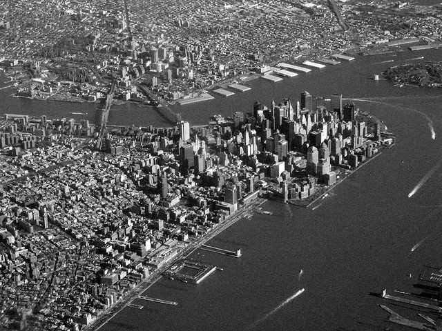
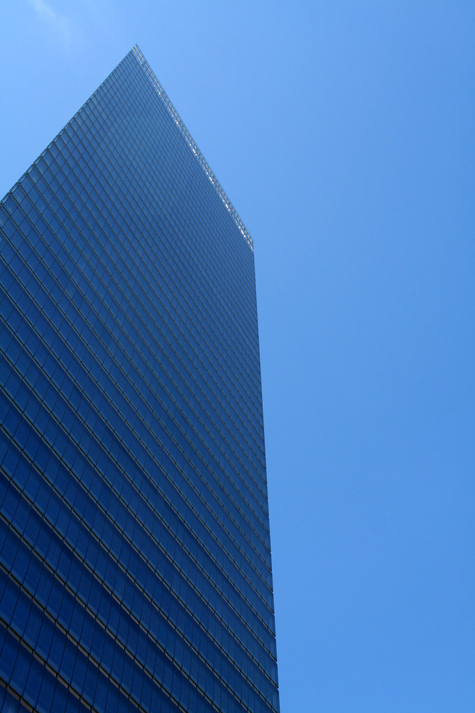
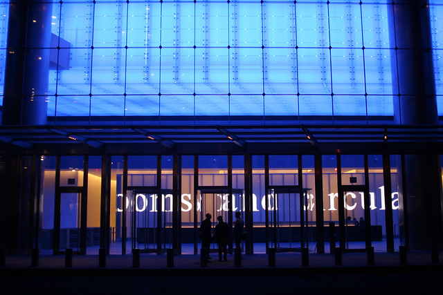
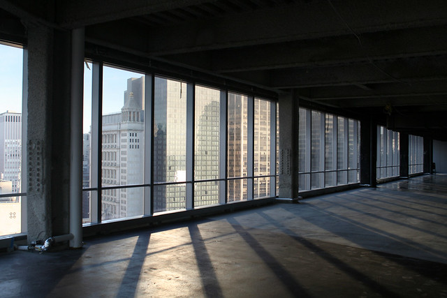
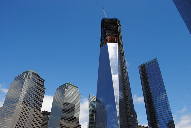
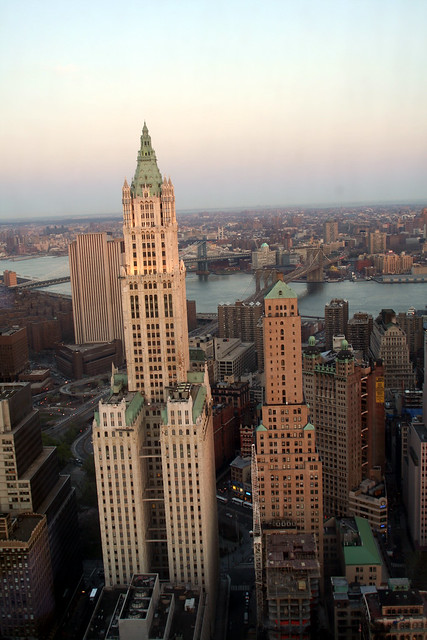
Fanning out from its headquarters bounded by Vesey and Murray Streets, next to the World Financial Center and a block northwest of ever-rising ground zero, there is now a kind of Goldman village anchored by Goldman Alley, as the locals call the public passageway between Vesey and Murray that’s shielded by a tilted glass canopy.
via It’s a Goldman World in Battery Park City – NYTimes.com.
Tag: New York City
7 World Trade Center
The Architecture of Fashion
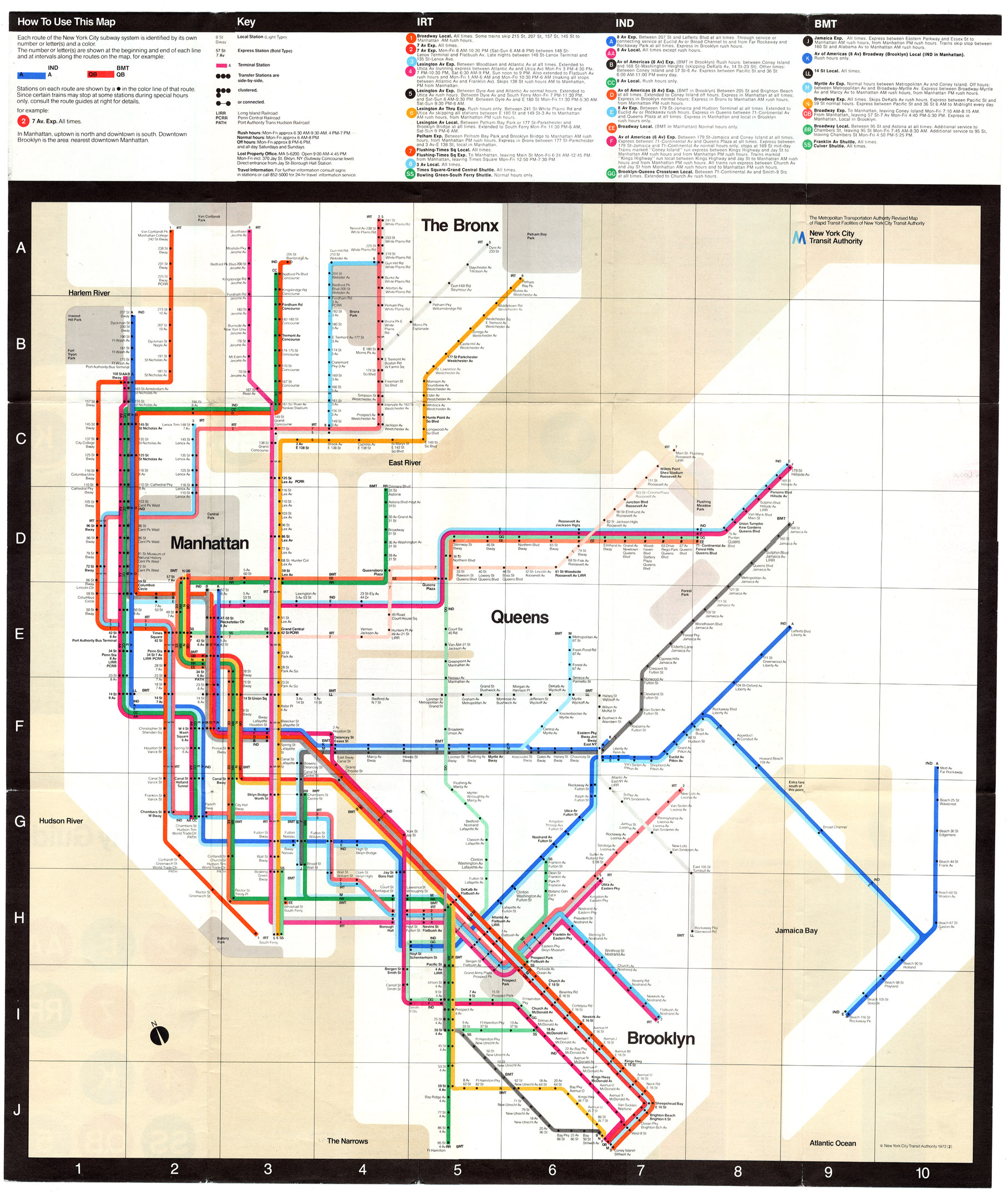
On New York Subway Map’s Compounding Travesty
Pedestrians on Broadway in this area can stumble upon an Ivy League university or gaze through the windows of Tom’s Restaurant, of “Seinfeld” fame. They can find a copy of “Pride and Prejudice” for $2 at a stand on West 112th Street, and, four blocks south, a taco for 50 cents more. They can even sip mojitos at Havana Central at the West End, near West 114th Street.
But they will never find West End Avenue between Broadway and Riverside Drive.
Mr. Tauranac, who has for years assailed Mr. Vignelli for such inaccuracies as having Bowling Green north of Rector Street, said the revelations had forced him to re-evaluate his harsh judgments of Mr. Vignelli, 81. “It really has dulled my attack, that’s for sure,” Mr. Tauranac said.
Moments later, he retrieved from his office the May 2008 copy of Men’s Vogue, featuring an updated Vignelli map “every bit as terrible a map as he designed in 1972,” to Mr. Tauranac’s eye.
“I’m happy to see that he’s mellowing,” Mr. Vignelli said.
via On New York Subway Map, a Wayward Broadway and Phantom Blocks – NYTimes.com.
The current map is an abomination of design, the revelation of more mistakes just compounds the existing travesty. Not that Vignell’s 1972 map is any better with oversimplification, a precious use of color and lines rendering it more art piece than functional map or diagram.
It seems every designer is trying to reinvent Harry Beck’s amazing diagram for both the Paris Metro and the London Underground:
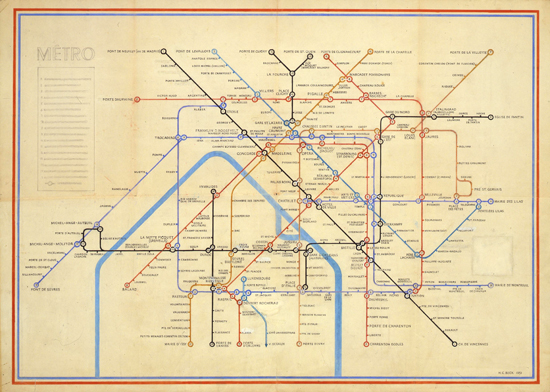


The problem being that Beck’s Underground Map is uniquely suited to London’s system, not New York City subway’s combination of express/local lines, geography and history of being composed of three different subway companies.
See also
New York, Newark, Bridgeport Metropolitan Statistical Area
The Metrocard Project
The Metrocard Project is an ongoing project that aims to redesign the iconic New York City Metrocard in a fresh way. The project was created by Melanie Chernock, a graphic designer studying at the School of Visual Arts.
Survey of tallest Buildings in New York City

1 World Trade Center Will Reclaim the Sky in Lower Manhattan:
If the winds are forgiving enough over Lower Manhattan — up where workers can see the whole outline of the island’s tip — a steel column will be hoisted into place Monday afternoon atop the exoskeleton of 1 World Trade Center and New York will have a new tallest building.
More important, downtown will have reclaimed its pole star.
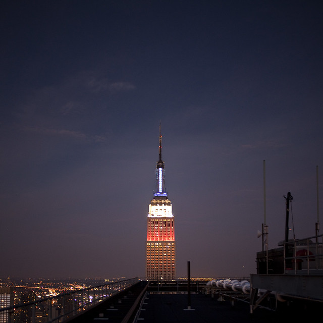
Poking into the sky, the first column of the 100th floor of 1 World Trade Center will bring the tower to a height of 1,271 feet, making it 21 feet higher than the Empire State Building.
Below is a selection of the five tallest buildings in New York City.
1 World Trade Center
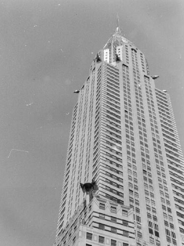
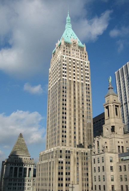
Chrysler Building – May 27, 1930
Project Glass and the Perils of Not Shipping
I guess today we will be talking about Project Glass by Google today on the Internets:
We think technology should work for you—to be there when you need it and get out of your way when you don’t.
A group of us from Google started Project Glass to build this kind of technology, one that helps you explore and share your world, putting you back in the moment. We’re sharing this information now because we want to start a conversation and learn from your valuable input. So we took a few design photos to show what this technology could look like and created a video to demonstrate what it might enable you to do.
If you can get past the very horrible industrial design of the glasses – a kind of cross between Geordi’s VISOR and a Orthodontic headgear – you slam right into the meat of the issue: why would you let an advertising company know and see where you are doing at every minute of the day:
There’s some incredible Orwellian doublespeak at work here, e.g., technology that “helps you explore and share your world, putting you back in the moment.” As far as I can tell, it doesn’t help you to explore your world at all. It helps Google to explore your world.
Additionally, from the video all I see is the same well-worn interaction clichés: overlay icons showing weather updates, emails and instant messages and route finding. Heads Up Displays which overlay data and information are great for specific functions requiring extreme concentration or placing discreet data which eliminates repetitive distraction. Think landing the Space Shuttle, or more everyday, driving on the highway and needing to know your speed. However, they aren’t great at supporting constantly shifting tasks and needs – tasks and needs which are situated in the urban environment will be contradictory and computationally dense.
On a lighter, but equally important note: what New Yorker doesn’t know how to get to Strand? A bookstore which, not to underplay this, is on Broadway and 12th Street not 12th and University as the video shows:

Below is the actual directions to Strand, via (wait for it) Google Maps:

Even this is wrong: who in their right mind wouldn’t just walk down Park and then Broadway? Come on Google: you are a mapping service for pete’s sake.

Finally, the images of the actual product are underwhelming to say the least – and quite possibly a joke: I can’t take seriously the tiny white bar actually holds the following (off the top of my head):
- Battery plus charging port
- Display
- 3g/Edge radio
- microphone
- speaker
- main processor
- graphics processor
- camera
- I/O (bluetooth or micro USB)
This is why John Gruber’s comments, The Type of Companies That Publish Future Concept Videos, are so apt and damning:
The designs in these concept videos are free from real-world constraints — technical, logical, fiscal. Dealing with constraints is what real design is all about. Institutional attention on the present day — on getting innovative industry-leading products out the door and creating consumer demand for them — requires relentless company-wide focus.
Compare the Google Glasses videos, with the work my friend Adam Greenfield and company at Urban Scale did with their Project Perry (Farevalue) exploration of adding an e-paper display to the standard RFID-based stored-value card:
Our Farevalue project is intended to address some of the minor but real frustrations people experience with RFID-based stored value cards.
…
But what if you had a way to know how much remained on your card before you hit the turnstile, and it didn’t require tapping on a reader? What if that information was presented to you in a friendly way, at a sufficient size that you could read it at a glance from across the room?
Project PERRY: technical proof-of-principle (version 0.1) from Urbanscale on Vimeo.
Project PERRY: Farevalue technical prototype from Urbanscale on Vimeo.
The difference between Farevalue and Google Glass is startling: Urban Scale actually shipped a complete idea and implementation prototype. They did the hard work of prototyping both the interaction and the hardware needed to solve a real-world problem. Google Glass appears to be a solution in need of a problem, coupled with a lack of real-world engineering knowledge. Google hasn’t gone through the pain, sweat, tears and cursing to actually prototype their concept. Rather, they have done is throw a – to be fair nicely crafted – set of glasses on pretty people and crank out a video.
The Google Glass announcement, and the glossy photo format, doesn’t get me excited, it does exactly the opposite. It makes me wonder if Google Glass will join the pantheon of other Google products: Buzz, Wave, Labs and the rest of the graveyard.
Jonathan McIntosh created ADmented Reality, a slightly more realistic version of Google’s augmented reality glasses – now featuring contextual Google Ads!
You call them Lobbyists, we call them Expeditors
Big Media Matt has a prickly post riffing on a Politico story arguing that, Mitt Romney Shouldn't Need a Dedicated Lobbyist To Build His Tacky Megamansion:
Romney’s house sounds tacky and extravagant, but it’s not some kind of public safety hazard in urgent need of regulation. You shouldn’t need dedicated lobbyists to get permission to build buildings on property you legitimately own. At the end of the day, Romney is going to be able to hire the lobbyist and get his mansion built. But these same hurdles afflict people who might be interested in affordable housing for low-income people or simply regular old market rate structures for the middle class.
Not to defend Mitt Romney, but aesthetics aside, hiring a third-party to navigate regulations isn’t ground breaking.
In New York City, generally you need an Expediter to file a permit application at the Department of Buildings in order to assit you through the different building codes (there are three currently in force), zoning codes and the general bureaucracy which each building permit application must go through to gain approval. The regulation complexity of having 200+ year old tenement buildings next to skyscrapers (the above photo has structures built ranging from 1883 to 2011) has created a new middleman whose job is to push paper, and in some cases, offer code review. Sometimes the Expediter is the very same architect which is designing and overseeing the project; I was once an Expediter and dealt directly with the DoB on projects I was designing under the review of a licensed architect. This is normal and part of the current process in New York City, Washington DC, Cincinnati, and other locations.
Aesthetics aside, I would argue that structures are, contra Yglesias, a public safety hazard in urgent need of regulation: buildings can, and do, fall down killing people. Having an effective, and efficient, code review process is necessary and proper to guard the citizenry from unsafe and hazardous building. Just recently an architect in California was charged in the death of a firefighter after he installed four outdoor fireplaces inside the house, in violation of building codes. This architect basically built a firetrap, and used faulty piping for the sprinklers which appears to have directly contributed to the death of a firefighter.
There are tons of other examples of willful or unintentional negligence by architects, engineers and builders which has caused building damage and death. This is why becoming a licensed architect is so onerous, and why building codes (which often seem to get in the way of your precious design) are to be followed.
Can the permit process be more efficient, and less encumbered by red tape? Yes. Should government find a balance between efficiency and the mandate to create a safe environment? Yes. Does the presence of this third-party mean we should deregulate building permit applications? No.
I hope that Matt is arguing for more efficient code review, rather than no code review; the only reason Politico called Romney’s expediter a Lobbyist is that it fits Romney’s larger narrative of being out of touch and super rich (which is probably true).
