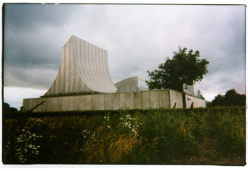
 utzon prototype in herning 01 (ca. 1969), originally uploaded by seier+seier+seier
Excellent jorn utzon, architect photoset via Super Colossal.
 utzon prototype in herning 01 (ca. 1969), originally uploaded by seier+seier+seier
Excellent jorn utzon, architect photoset via Super Colossal.

We know exactly what our country’s land holdings are from years of looking at maps. Australia’s is perhaps the most unique landform in the world – a continent-sized island. Via BldgBlog Link comes good news for Australians today, because their country just increased territory overnight at a flick of a pen when UN’s move expands Australia’s territory:
Australia’s territory has expanded by an area five times the size of France after the UN agreed to its jurisdiction over a massive amount of seabed, Resources Minister Martin Ferguson said Monday.
The UN decision to extend the country’s borders south, west and east to include a further 2.5 million square kilometres (965,255 square miles) could potentially provide a “bonanza” in underwater oil and gas reserves, he said.
When maps include the territorial waters, a completely different country emerges; a country which is hardly recognizable from the normally accepted political boundaries. Yet the last map, the 2008 Present Territory Map, is the fully realized political boundary of Australia, which is hardly ever considered. Fully political also in that they were able to make a case to the United Nations to increase their territorial holdings, which according to the News Limited, means more resources and more energy (to sell to China?):
He said the decision also improves Australia’s chances of securing its energy future, and that of other nations.
“As you can appreciate when you sit down and talk to countries such as Japan, Korea, India and China the big issue they want from us is security of supply and that goes to the energy security debate,” he said.
…
“Surveys are being undertaken in the Lord Howe Rise region … looking at the petroleum prospectivity of the seabed in that area,” he said.
“It’s one of the areas Geoscience Australia has been looking at for this pre-competitive work … (and) there are similarities with areas that oil has been found in closer to Australia.”
Below is the morphing map of Australia:

Below is a concise history of the territorial holdings of Australia (PDF from Geoscience Australia), in five maps and an animation.
Continue reading “United Nations expands Australia’s territory”
 JFK Terminal 5 and 6, originally uploaded by helmutfaforke

See also Terminal 5 photos.

Check out Jonathon Yule’s Font Bots (typetastic!).
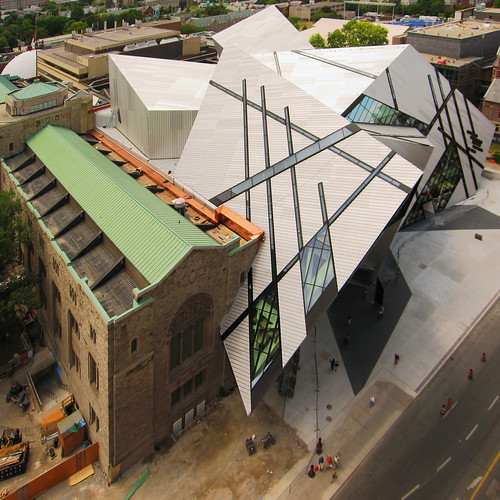 The extension to the ROM by Daniel Libeskind, originally uploaded by livinginacity
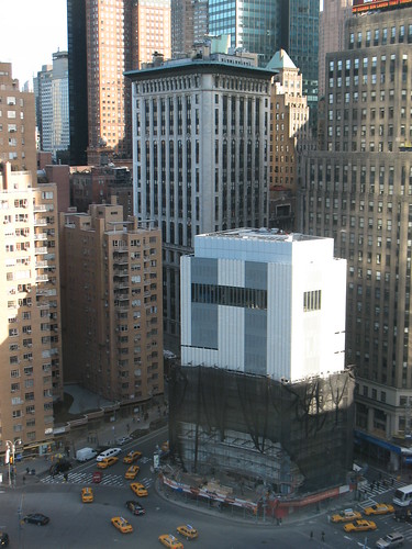 Appert0402444EP, originally uploaded by yearinpictures
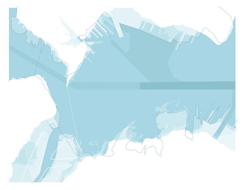 middle_branch_coastlines_sketch, originally uploaded by ske765book
Also see Boston Figure/Ground 1804-1912 by Bill Rankin, 2005.
My Accessible Transit – New York City Subway article has been found again and there are some general questions about the methodology. This map was created based on data I collected from the MTA’s website based on accessible stations as of Quarter 3 of 2007. As update occur based on the elevators coming in an out of service, I’ll update the map.
But the basic fact of the matter is that for those with accessibility issues, the NYC Subway is a huge barrier.
As per requests, here is a Accessible Transit – New York City Subway PDF version (1.1 mb pdf).