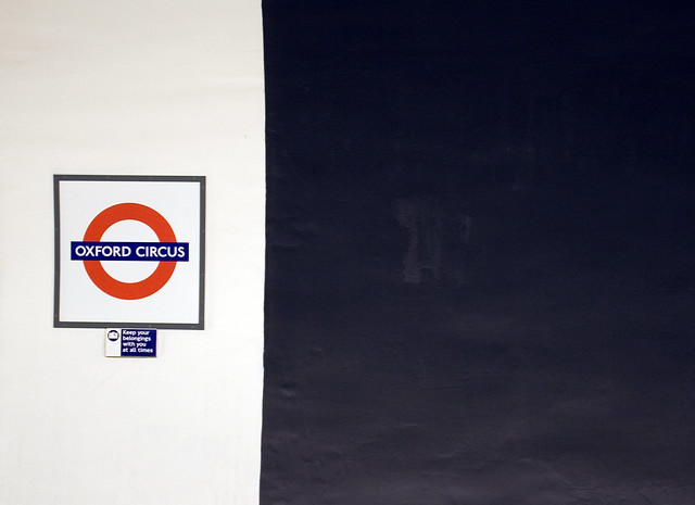
The main argument of using Helvetica is that it’s “neutral.” That is absolute bullshit. There is nothing neutral about Helvetica. Choosing Helvetica has as much meaning and carries as many connotations as choosing any other typeface. It has as many visual quirks as any other typeface it was meant to shun for needless decoration. Helvetica is the fixed-gear bike of typefaces: it’s as basic as it gets, but the statement it makes is as complex as anything else. Standing for independence and going against the grain, supposedly not caring about what others think or of being duped for the upgrades and improvements that “the man” forces upon us. Helvetica is old. Helvetica is clunky. No business, service, or product deserves Helvetica in the twenty-first century more than anyone deserves to sit in a dentist chair in the 1960s.
– New University of the Arts London Logo, or Why I Hate Helvetica
