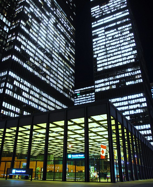
 Signature Shot, originally uploaded by plemeljr
Tag: architecture
Toronto-Dominion Centre (1965)
Toronto-Dominion Centre (L. Mies van der Rohe 1965), originally uploaded by ettml
Richard Serra & San Carlo alle Quattro Fontane
S. Carlino, originally uploaded by el buitre
IT WAS in Borromini’s church, San Carlo alle Quattro Fontane, in Rome that Richard Serra first saw the light a decade ago. “I was standing in a side aisle, looking at the oval space on the floor and the same oval on the ceiling, called a Borromini ellipse. I thought they were at right angles to each other. When I moved to the central aisle, I realised I was wrong. But I kept on wondering: how can I create—how can I actually make—my misrepresentation?”
Farnsworth House Flood 2008: The Aftermath

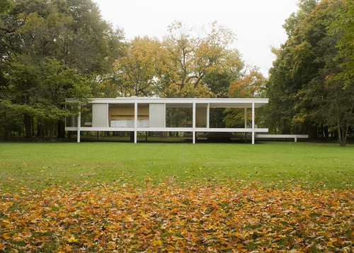
As was previously reported, the Farnsworth House Flooded Again, and it was only recently that the good people at the National Trust for Historic Preservation could assess the damage:
The flood waters started to recede yesterday morning, and unlike the flood of 1996 when the waters rose over 4′ into the house, it appears it was about 18″ above the floor level this time. Our very ingenious low-tech way of raising the furniture on plastic milk crates worked and not one of them was displaced.
…
No glass was broken and the travertine floors on the interior seem only mildly dirty. We still don’t know the full impact to the mechanical and electrical systems but are hopeful since most of the equipment is located more than 18″ above the floor. Several very large trees were literally uprooted and getting an arborist in to determine the safety of some of the other trees is a priority.
Also, they have video of the floodwaters, prior to entering the house:
Stay tuned to the Preservation Nation Blog for updates on the cleanup effort.
Farnsworth House Flooded Again
 Photo of the Farnsworth House Flood of 2008 by the National Trust for Historic Preservation
If yesterday was a bad day for the SUPERTRAIN, today is a bad day for Modern architecture. The effects of Tropical Storm Lowell has flooded Mies van der Rohe’s Farnsworth House. The Fox River in Plano, Illinois crested eight feet above normal water level, flooding Mies van der Rohe’s Farnsworth House, which is elevated five feet above the flood plain. The National Trust for Historic Preservation has not been able to asses the situation.
As of mid-day Sunday, flood waters rose above the 5-foot risers on which the steel, glass and stone home sits, leaving its interior covered in another two feet of water, said Whitney French, historic site director.
…
Employees at the Farnsworth House used boats to reach the home on Saturday and lift the designer furniture away from the water. Some pieces, including a custom-designed wardrobe bound to the floor, could not be saved. Officials could not yet estimate the cost of damages.
…
The architect suspended its floor slab to allow flood waters to run beneath the house. Still, waters have risen above the raised level six times in 60 years, French said.
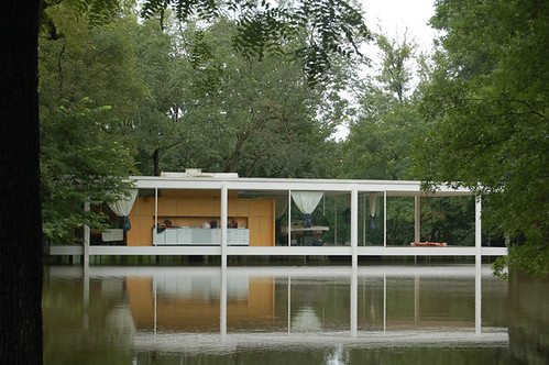 farnsworth house flood, originally uploaded by park.will
The above picture illustrates the last time the Farnsworth House was flooded in 2007. Information from the Farnsworth House Website paints a bleak picture:
Ludwig Mies van der Rohe’s famous modern masterpiece, the Farnsworth House, fell prey to Mother Nature Sunday, September 14, as flood waters rose two feet over the top deck, entering the house. Built within the flood plain of the Fox River in Plano, Illinois, the house stands on five-foot tall columns which proved not high enough as record breaking rain amounts brought the river to over eight feet its normal level. More than eight inches of rain fell in two days as Tropical Storm Lowell passed through Saturday, immediately followed by the remnants of Hurricane Ike Saturday night and Sunday. Fox River waters rose quickly and by Sunday morning, September 14, they had breached the interior of the house by over a foot.
For reference, below is the google map of the Farnsworth House.
Robin Hood Gardens Design Competition Results Announced
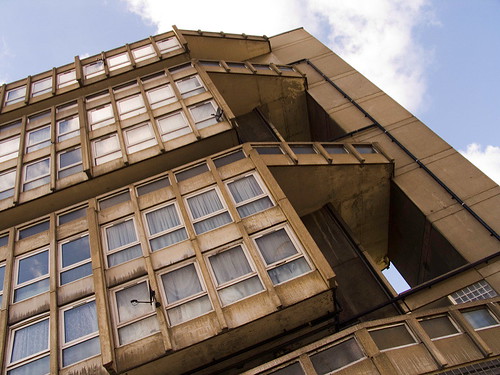 Robin Hood 05.jpg, originally uploaded by joseph beuys hat
The top entries in BD and the Architecture Foundation’s ideas competition for Robin Hood Gardens show that inspired refurbishment of the estate can give it a new vibrancy while reaching the required density levels.
Check out Zoran Radivojevic’s design for Robin Hood Gardens in depth and the rest of the competition finalists and an interesting proposal from Super Spatial involving kinetic parasitic structures.
See Also:
Robin Hood Gardens
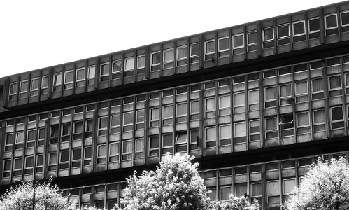 Robin Hood Gardens, originally uploaded by Doilum
Apparently, Gordon Brown wants to demolish Robin Hood Gardens designed by Alison and Peter Smithson. Luckily, Building Design Magazine is rallying to its defense. For an excellent contextual explanation of Robin Hood Gardens, check out this rather long post by Dan Hill, Robin Hood Gardens is not the same as a digital model of Robin Hood Gardens.
Herb Ryman Disney Sketches
 dgcastle1, originally uploaded by Disneyland Postcards
For more sketch goodness, see the Herb Ryman Flickr tag.
From the Archives: Disney World Typography

To Trains, originally uploaded by Mista Gargoyle
So I admit that I’m a bit of a font geek – typography, like fashion, interests me because not only because of its’ variety but also my fascination with the process of creation; which, even to someone schooled in design, is quite perplexing and mysterious.
I’ve linked to this before, but anyone interested in the fonts used and designed by Disney, must check out Mickey Avenue – Disney Fonts. Regardless of what you think of Disney from its’ abuse of copyright to Disney’s shell city in Florida to whatever ill you accuse Disney of perpetrating, you cannot ignore its’ influence on design and culture (for good and bad). That is why sites like Mickey Avenue and the accompanying photos of typography are so cool to go through.
For example, check out two examples of Coca-Cola advertisements, one in Tomorrow Land and the other in Animal Kingdom:

Tomorrowland Coke, photo by Mista Gargoyle

Animal Kingdom Coke, photo by Mista Gargoyle
The commitment to design which Disney adheres to is amazing. I realize that there is an incentive for advertising to adjust to the theme of whichever Disney Kingdom it is located, but Disney applies this same level of design throughout their theme parks. (Now, if their movie division could do the same…)
Sometimes design can leave an attraction, or a whole kingdom in a state of limbo. EPCOT Center is curiously stuck between aged retro and futuristic glee, all due to the design of the park. When I visited Disney World in 2003, EPCOT was the one park which was clearly dated. This is perhaps due to the type choice – World Bold – which the rounded sans serif vacillates between Buck Rogers and some unseen future. Place this type in the context of large exuberant buildings clad in glass and aluminum (the material of the future!) and concrete, and you get a Tomorrowland which you know is based in Yesterdayland. It is quite disturbing actually; once inside the Disney Reality Distortion Field, this jarring, bleak urban landscape destroys any suspension of disbelief.
But enough of the EPCOT critique. Anyone interested in what a single, hive-mind can accomplish through design, you must check out Disney.
For more Disney stuff, check out this Retro Disney Resort Logos, more photos of Disney Signage, and a Hi-Resolution Aerial Photo of Disneyland.
