Tag: architecture
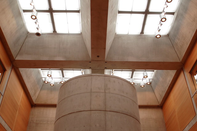
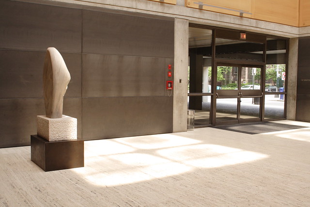
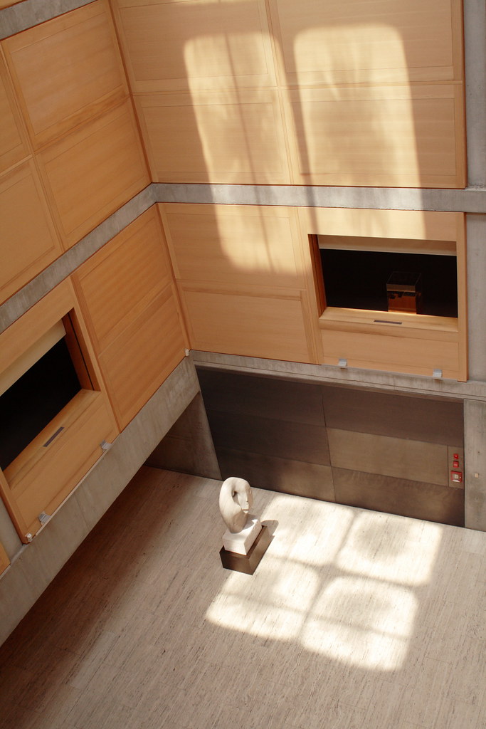
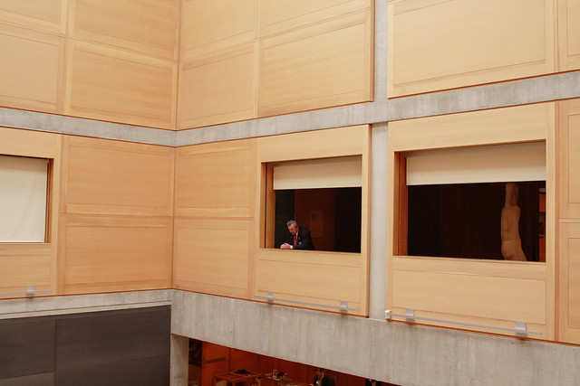
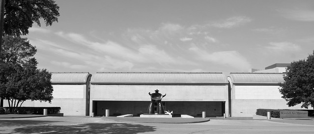
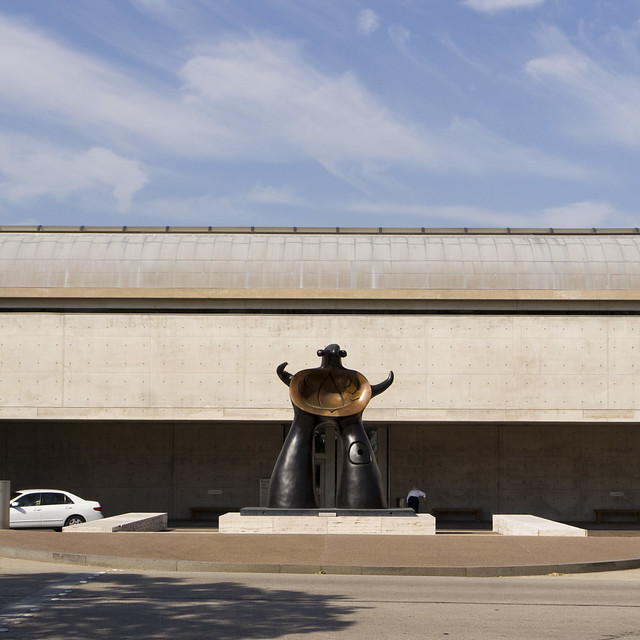
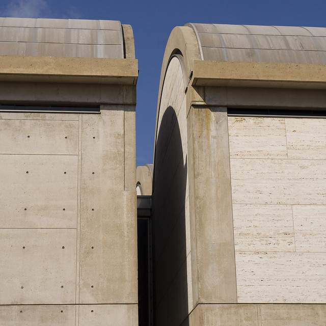
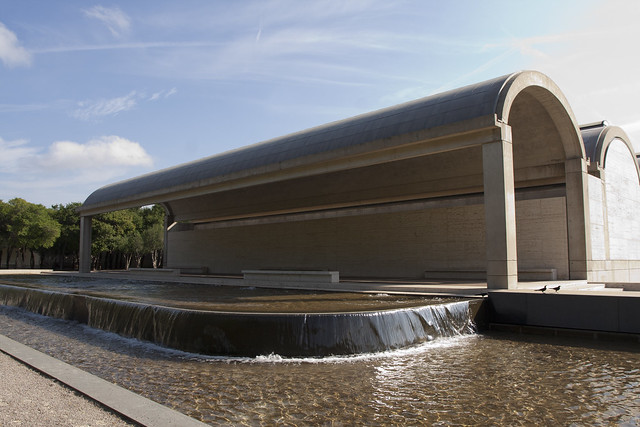
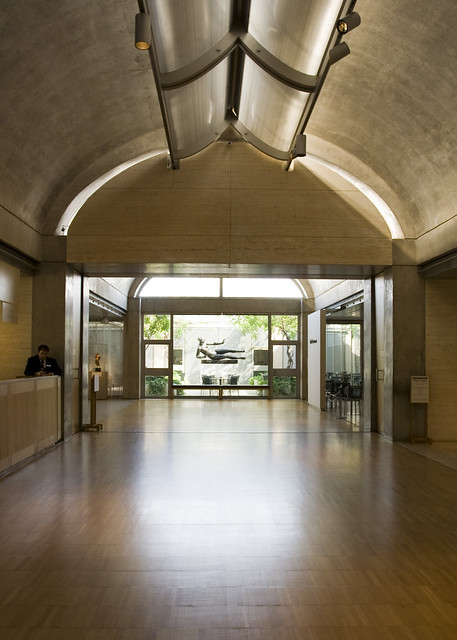
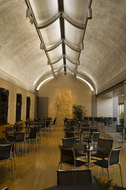
Kimbell Art Museum by Louis Kahn
Reader Response on the Eisenhower Memorial
It might seem to be all Eisenhower Memorial all the time around here, but stick with us. If you are just joining us, here is the nickel version: Frank Gehry was selected from a short list of pre-qualified firms to design a memorial in Washington D.C. to President Eisenhower. His design has been met with a vocal minority of critics, which I covered in On the Eisenhower Memorial Critics. The criticism hasn’t fallen on deaf ears, as just yesterday a revised Eisenhower Memorial design was unveiled.

A conversation with a Gehry critic
I have been corresponding for the last few days with a reader and critic of the design, a reader who I believe to be connected with the National Civic Art Society, one of the leading groups against the memorial. I want to thank Reader M for the conversation, which could have gone off the rails into yellingtown easily. Below is a roundup of Reader M’s conversation:
Perhaps those who oppose the Gehry Memorial oppose the memorial for sound aesthetic, contextual, and factual reasons. Please understand that those who oppose the memorial are not insane fanatics who intend to destroy you. Our built environment needs sound criticism. I would hope that in the future you consider your written opinions seriously, deeply, and fairly.
…Architecture is not a calling. The practice of architecture is an art, a craft, a job. Architecture is the structures made for human use. Good architecture serves humanity well. Great architecture improves humanity. Gehry’s memorial is not great architecture, it is not good architecture, it is not good art, it is probably poor craft, but it is an important job. Gehry has made fine buildings. His design for the Eisenhower Memorial is not among his fine buildings.
…Why should the monument not be built? Because Gehry’s Eisenhower Memorial design insults the president, the general, the man. Gehry’s insult in this building is similar to the insult Gehry forcefully makes to those who have suffered brain injuries in his Lou Ruvo Center for Brain Injuries building. If you are unfamiliar with this building, find a picture and you will see the implicit sadistic insult of its form. The insult to Eisenhower is not so much in its inarticulate form as in its bluntly stupid misinterpretation of the heroes’ role in the life of a nation’s citizens. Perhaps Gehry makes this error because he is not a hero, perhaps because he is anti-heroic, perhaps because he is dimwitted. Having seen Gehry on video-tape, he is, in my opinion, the only star in his universe: yes, he is dimwitted because he is incapable of sympathy. The man understands in stereotype, unsubtly.
I speak here, generally, of both the former, failed design, and of the current improved, failed design. Ask yourself: Could a freshman, basic design class from a typical 1970’s art school have produced either design. If you are honest, you must say that, “Yes, Gehry’s Eisenhower Memorial design is no better and no worse than the typical, awkward freshman art project.” His design is celebrated because he is thought to be a great architect, because experts agree that he is a great architect, because he is just now in fashion for all the foolish pretexts. If you cannot see with your mind’s eye, I cannot help you. Yet, I suspect that you can see Gehry’s typical failure in that that room full of typical failures, and seeing can understand my point. Dwight David Eisenhower deserves better.
…Oh, yes: The insult. Eisenhower is not insulted because he was a boy, you too were a boy, many of us were boys and did this-and-that in the way of boys, almost none of what we did being worthy of comment. Kansas’ Senator Roberts is pleased that Kansas is represented in the memorial, as he would be pleased with a billboard of Kansas on I-395, but neither Kansas nor boyhood is essential to that internal presence–shall we say soul, the Spirit of God, our aspiring humanity, surely we will not imagine a nonexistent id or ego–that imposed itself upon the world. Well, if not that indescribable internal thing then the body, for certainly the man had a body, as we all have bodies, yet bodied we do not all achieve excellence, so the body alone is not the thing, nor is boyhood, nor is Kansas. What then is the meaning of the man? A few cherry picked quotes advancing a leftist theme? It was honey in my cup to read the Gehry team misspelling “Farwell Address” [Farewell Address] in the too often referenced military-industrial complex paragraph. As you know, bodies are not the manifestation of photographs, as modernists seem to believe, and Modernists seem almost incapable of creating statuary that has not been derived from photographs: This is as though the proof of existence is the superficies of things, not the essence of things.
What in this monument insults Eisenhower, other than that he would not approve the style, the physical magnitude, and the diminutive concept? Eisenhower is insulted because he was not a body doing things here-and-there, saying this-and-that, too large and too small, haphazardly from part to part, confused, awkward, reduced to a not-quite-clever design project. Do you suppose that Eisenhower standing in front of this monument would recognize himself, other than in the accuracy of his manikin image? Would he be proud, humbled, embarrassed? I could go on, but the theme is so obvious that it is a bore. For all the mods’ high-falut’n rhetoric of meaning abstracted, mods seem incapable of manipulating form to create meaning. Inarticulate, the mods can destroy, can distort, can disembody, but they cannot create that internal spirit which is universal in classical form and idea. Let Gehry make twisted planes to amuse children and the child-like culture, let him flatter know-it-alls, and let him tickle social climbers, but please, do not let him fumble the precious gem of our nation’s honor.
This new model contains all the old, twisted cyclone fence bird and trash trap, but is not shown. Support it, if you like. Call we who oppose it conservatives, anti-revolutionaries, rotten nuns who would take away your candy and slap your knuckles with rulers, but give us credit with keeping the house in order…
Typologies of criticism
From my correspondence with Reader M, and reading other critics of this project, the overall criticism seems to fall into four categories:
- Eisenhower’s family opposes it, so it shouldn’t be built
- Frank Gehry is a bad person
- Gehry’s past work is horrible
- The memorial design itself is bad
The first is laughable – if the Eisenhower family wants to build a memorial on their land, be my guest. They don’t get a veto when public land is being used and the federal government is sponsoring the memorial. They are free to voice their opinions, but their opinions are weighed with other professional, and lay, criticism.
The second group of criticism is anchored around Frank Gehry’s past writings, and himself personally. There appears to be a new (as in last 5-10 years old) pattern of vilifying publicly famous architects, such as Frank Gehry, in a manner which politicians and public officials would find familiar. Changing names and subject, the accusations lobbed at Gehry – he is dimwitted, without sympathy and he willfully insults brain patients – could all be 30 second political commercials. This type of criticism, that an architect has malice against brain patients especially, is unneeded. Also unneeded is accusing architects of designing Nazi concentration camp fences – Susan Eisenhower accused Gehry of this (really) – when disagreeing with a design decision. The ridiculous Truth about the Eisenhower Memorial (as if the truth was being concealed) website has pages and pages of quotes from Gehry, taken out of context, proving he is a bad man. Most quotes focus on Gehry’s observation that contemporary life is, chaotic, dangerous, and surprising. Buildings should reflect that.
Critics: personal attacks agains the man, not the idea, weaken your criticism and make you look petty.
I will grant past work informs current and future work, but I ask critics to keep their critique with the memorial itself; use past work as a contextualization of the design at hand.
As for actual criticism of the design itself, often it is vague and ambiguous. Milton Grenfell, vice chairman of the National Civic Art Society, said the new design remained overscale, “with huge iron curtains,” and called the inscribed stones perched atop one another “willful” and “anti-aesthetic,” giving a feeling of “something that’s not going to last.” Is Mr. Grenfell really calling Gehry anti-beauty?
Finally when pressed for specific issues with the current design, critics often rely on the fallacy that the design is so self-evidently and obviously wrong that they don’t need to explain why or how. This is the most frustrating part: just explain why you don’t like it.
Case in point: the mini-controversy about showing Eisenhower as a small child. I still don’t understand why showing Eisenhower throughout his life with three statues – as a boy, a General, and as President – is an issue. From my understanding his humility was a core feature of his life. Eisenhower’s story is uniquely American: a boy from Abilene, Kansas growing up to lead one of the most powerful forces ever assembled, and then putting aside his weapons to lead the nation as a civilian President. That’s a great story, but it is so wrong and beyond the pale that no explanation is required – because it is so wrong.
Across all these categories is a thin layer of perceived persecution and fear that some other is hiding information. The National Civic Art Society’s website is entitled The Truth about the Eisenhower Memorial, as if it was hidden. The whole tone of the website would be familiar to those who have landed on conspiracy websites: webmasters reveal the truth
to their readers which was suppressed by nefarious forces.
Critique of the now
What was interesting about the conversation, is that Reader M kept bringing up Modernism, as if this was all Modernism’s fault. I don’t think the use of the term “mods” – as in Modernism – quite applies to Frank Gehry or many contemporary architects. Certainly Gehry’s peers such as Zaha Hadid, Rem Koolhaas, Peter Eisenman, or Bjarke Ingels would not be called Modernists either. Modernism as a movement hasn’t been relevant in some time. What I hear for these critics is a critique of contemporary modernity, not Modernism, and a desire to return to an architecture which has an “internal spirit which is universal in classical form and idea.”
Well, unless you want to turn the clock back on time (and yesterday wasn’t as great as you think it was), that isn’t going to happen. At best we can look to form a syncretic mix of classical values, ideals and forms, with contemporary realty, need, desire, and technology. Gehry is exploring similar themes, in an albeit repetitive fashion.
I had a professor in college who would draw a dialectic between Peter Eisenman and Frank Lloyd Wright. He would pretend the two architects were arguing in a live debate. In the professor’s words, Eisenman was saying, “You can’t go back. We have to find a new vocabulary of expression to deal with the unique needs of the now.” And on the other side Wright would say, “Oh yes you can go back. Typologies existed since before time: a church has always looked like a church, and a chimney always has looked like a chimney.”
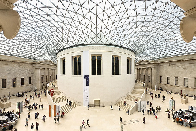
Both architect’s writing is highly polemical, and my guess is that we probably need to borrow from both sides of the dialectic. Maybe Foster’s Great Court of the British Museum (above) or Bjarke Ingels Group’s The Mountan (below) are good examples of this syncretic ideal.
Why obsess about this?
This isn’t a new debate – at some point an Ionic capital sculpter was probably being yelled at by a doric capital sculpter. Besides the infamous 1982 Harvard debate between Peter Eisenman and Christopher Alexander (please, send video!), what I feel has changed is the tenor of the discourse.
I am spending a lot of time thinking about this not because I think the Gehry designed Eisenhower Memorial is a landmark worth fighting for. Rather, I find the current level of discourse distressing and worrisome; we should all care that the critique leveled by professionals and laity lack coherence and actionable criticism. The firehose of vitriol against the man, and the design, gives me pause. Architecture and design has, and is, intertwined with the larger culture and public sphere. If the larger discourse around space, environment and culture continue down this path, then count me out.
Next up, what exactly are my thoughts on the Gehry designed Eisenhower Memorial? Those thoughts coming soon.
Basilica Papale di San Pietro in Vaticano
Revisions to the Eisenhower Memorial Unveiled

It has been a busy few days for the Frank Gehry designed Eisenhower Memorial. Yesterday we talked about the Eisenhower Memorial Critics, and I have been corresponding with critics from the National Civic Art Society in hopes to share their viewpoint here with their commentary.
Also yesterday Gehry Partners unveiled revisions to the Eisenhower Memorial:
The new proposal, unveiled at an Eisenhower Memorial Commission meeting, retains the metal tapestries surrounding an urban park framework, but offers changes to the memorial core that the architect hopes will give greater prominence to Eisenhower’s stature and accomplishments.
Gone are bas-relief sculptures in favor of three-dimensional, heroic-size statues of Eisenhower as president and general, with space for his accomplishments on the stone blocks and quotations on lintels above them. The changes address some of the original design’s focus on Eisenhower’s modesty by putting forth a more muscular representation of his leadership.
Frank Gehry, in a letter read by his chief of staff remarked, “How do you represent a man of such towering achievement whose modesty was one of his core values?” Gehry wrote. “I have refined the design to incorporate this feedback, which I believe helps tell the story of Eisenhower with more dignity and more power.”

Critics haven’t been mollified:
After the Tuesday meeting, critics said the new design still did not address key conceptual and aesthetic concerns. Justin Shubow, president of National Civic Art Society, says the memorial “still portrays Eisenhower as an unrecognizable boy or young man, which is at its core.”
Milton Grenfell, vice chairman of the civic art society and a classical architecture advocate, said the new design remained overscale, “with huge iron curtains,” and called the inscribed stones perched atop one another “willful” and “anti-aesthetic,” giving a feeling of “something that’s not going to last.” He said he hoped Congress would have a chance to weigh in.
I will have to disagree with the two critics mentioned by the Washington Post, both who work for the National Civic Art Society.
I don’t understand why showing Eisenhower throughout his life as a boy, a leader of men in combat, and a leader of men in service as President is an issue. From my understanding his humility was a core feature of his life. Furthermore a memorial illustrating how a boy from Abilene, Kansas grew up to lead one of the most powerful forces ever constructed during World War II, and then put aside his weapons to lead the nation as a civilian President is uniquely American.
His seminal Homecoming Speech in Abilene, Kansas on June 22, 1945 explicitly links his dreams to his youth and a deflection of honor from himself to the men he commanded:
Because no man is really a man who has lost out of himself all of the boy, I want to speak first of the dreams of a barefoot boy. Frequently, they are to be of a street car conductor or he sees himself as the town policeman, above all he may reach to a position of locomotive engineer, but always in his dreams is that day when he finally comes home. Comes home to a welcome from his own home town. Because today that dream of mine of 45 years or more ago has been realized beyond the wildest stretches of my own imagination, I come here, first, to thank you, to say the proudest thing I can claim is that I am from Abilene.
…
One more word, there was one thing in the parade today that was in error. A number of signs – I saw a sign, “Welcome to our Hero.” I am not the hero, I am the symbol of the heroic men you people and all the United states have sent to war. It has been my great honor to command three million American men and women in Europe. All those people from Dickinson County could not come back at one time for a celebration like this, I fully realize, cannot be held for the return of each but in the sum total, if you, as a community, accepts each one of those men back to your hearts as you have me, not only will you be doing for them the one thing they desire but for my part you will earn my eternal gratitude. Every one of those men is precious to me and each one coming back does not want special treatment; he does not want to be supported for life. The initiative, the self-dependence that made him great as a soldier, he expects to exercise in peace, but he does want to be received in the same friendly spirit that you received me. I know you will do it, not as parts of your war duty but out of the greatness of your heart and the warmth of your affection for soldiers that have laid everything on the line for us, even their very lives.
As for Mr. Grendell’s criticism of the memorial being “anti-aesthetic,” I don’t even know what that is supposed to mean. Does Mr. Grendell think that the design is a willful attack against beauty? Or does he just not like the way it looks?

There are many parallels between the reaction to the Eisenhower Memorial and the Vietnam Veterans Memorial designed by Maya Lin:
On November 13, the memorial turns 25. The criticism that dogged the project in its early days—its unconventional design, its black color, its lack of ornamentation—has given way to appreciation of its simple, emotional power. “In the past 25 years, it has become something of a shrine,” said Vietnam Veterans Memorial Fund President Jan Scruggs, who conceived the idea of building a memorial in 1979. “It has helped people separate the warrior from the war, and it has helped a nation to heal.”
They are two different memorials for two different needs: the Vietnam Vetrans Memorial is a place for reflection and healing. The Eisenhower Memorial celebrates the life of a man. I think Gehry has aspirations of creating a work which is on par with the Vietnam Veterans Memorial; here is hoping he can. I also hope critics can offer less attacks, and more ideas.
In further posts, I will be discussing the design itself and memorials in general (stay tuned as they say).
UPDATE May 2012
The discourse is happening – please read Reader Response on the Eisenhower Memorial.
Brute Force Architecture and its Discontents

You should read this, now:
Your lungs are full of foam fumes, your eyes are bloodshot from exhaustion, you’ve slept at your desk. But you stick with it, because you enjoy a pleasing degree of freedom to pursue design ideas that challenge accepted reason, so long as the lead designer sees something they like. Sound familiar?
If so, it’s likely that you work in one of the many global architecture offices who practice in the style of the Office for Metropolitan Architecture (OMA). Your work may look different but that’s not the focus of this discussion. The operations follows a similar logic.
Amongst the most critically acclaimed offices of the last two decades, OMA has consistently produced innovate architectural ideas, methods, and as we will see below, organizational models. This much is undeniable. The question at hand is whether the almost contagious ability of OMA to replicate itself in the habits of other offices is the result of duplication by admiration, a legitimate response to the challenges of globalized architecture practice which OMA may have pioneered, or the charismatic quirk of OMA’s success overshadowing other possibilities.
…
If the OMA style of working has become a popular drug, this is an attempt to figure out what we’re all taking, why, and what other options may exist. It’s a story that begins in the British countryside 39 years before the founding of the Office for Metropolitan Architecture.
Florence
On the Eisenhower Memorial Critics

If you have the stomach, read the Washington Post’s tic-tock about the Frank Gehry designed Eisenhower Memorial. I am no Gehry apologist, but he has become another pawn in Conservative Republican’s culture war:
Justin Shubow, president of a little-known nonprofit group, the National Civic Art Society, read back to Gehry quotes from years earlier, in which the architect discussed the inherent chaos of democratic cities, the way a discordant but often exciting stylistic diversity emerged as the rigid power structures of the 19th century yielded to more freewheeling forms of democracy. Gehry often speaks metaphorically of chaos and danger as powerful aesthetic energies. But Shubow seemed to take Gehry literally, as if he thought the architect wanted to vandalize the sacred center of Washington.
“I probably was talking to a bunch of students … who were afraid,” Gehry responded. “The chaos of the world around us is a fact, and recently it has gotten to be more of a fact.” What matters, Gehry continued, is what you make of that chaos.
Shubow argued that the memorial “represents death and nihilism in the same way that I see your black T-shirt, much beloved by downtown hipsters and nihilists everywhere, and its total rejection of the past and tradition and honestly everything that Eisenhower himself stood for.”
…
In the weeks and months after Gehry’s National Archives appearance, conservative writers and columnists would focus on the “barefoot boy” almost to the exclusion of all else, arguing that Gehry was diminishing Ike’s stature, ignoring his mature work.
…
In February, George Will branded the memorial “an exhibitionistic triumph of theory over function — more a monument to its creator, Frank Gehry, practitioner of architectural flamboyance, than to the most underrated president.” Ross Douthat in the New York Times said “the memorial sells the supreme allied commander’s greatness short.”

Leading the charge is Justin Shubow, of The Federalist Society, the ultra-conservative/libertarian think-tank which brought us Kenneth Starr and the wonderfully usless Clinton investigation of the 1990’s. Mr. Shubow started a new non-profit called National Civic Art Society which pedals out-of context quotes and a conspiracy theory quality website attacking the memorial. Labeling a mockup of the tapestries Shocking “Tapestry” Photos (complete with scare quotes) with photo commentary alleging that, We do not believe these photos have ever been seen by the public or media — for good reason.
Really?
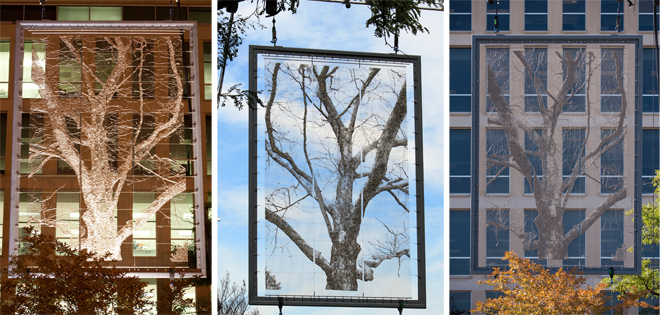

Shubow recently accused those who point out that his organization is really just the Heritage/AEI/Federalist Society in a new name as playing politics (what does that mean in this context: nothing). What is telling is that Shubow et al are really against modernity (not Modernism):
Is it “nostalgia” to ask that the Eisenhower Memorial “shall blend with the essential lines of the old”? Would Knight like to see Paris “improved” by some more oppressive skyscrapers à la the Tour Montparnasse, a Modernist middle finger to centuries of humane harmony? Should Venice, Rome, and Florence get with the times, and hire a starchitect to jazz up their hopelessly backwards cities?
Anyone looking to see what happens when civic architecture abandons such traditional values as harmony and beauty need look no further than Boston’s Brutalist City Hall, San Francisco’s schizo Federal Building, London’s City Hall (a leaning tower of pickle), and the truly bizarre Scottish Parliament Building. In D.C., there is the wasteland of L’Enfant Plaza, the alien gun-tower Hirshhorn Museum (straight out of Battlestar Galactica), and HUD Headquarters a.k.a. the Ministry of Monstrosity.
Architectural Modernism and its deformed descendants have been utter failures both aesthetically and functionally, not to mention aberrations from the entire sweep of civilization. Their works and underlying ideas are headed for the scrap heap of history, where they will join Gehry’s Eisen curtain.
How have they been failures, and why? But that isn’t asked nor given. It is tautological fact that Modernism is a failure. Setting aside the fact that Modernism has a colorful history with successes (Lever House) and failures (Pruitt Igoe), no one labels current design trends Modernism. Which tells me that the opposition comes from some deeper Id.
Mixed up in that list are flavors of Modernism from (Boston City Hall by Kallmann McKinnell & Knowles and Robert C. Weaver Federal Building by Marcel Breuer, to the Hirshhorn by Gordon Bunshaft. Also on the list are newer buildings ranging from the Scottish Parliament Building by Enric Miralles to City Hall by Norman Foster. Arguing that City Hall doesn’t have harmony and beauty is obtuse. This list reads less as an indictment against Modernism or Contemporary architecture than a list of “Things I don’t like, in no particular order.”
This is a list of someone who rejects modernity.

Critics have compared Gehry’s tapestries to billboards, the Iron Curtain and the fences that surrounded the Nazi death camps; they have invoked the names of Marx, Lenin and Engels, as Susan Eisenhower did at a congressional subcommittee hearing. Criticism is fair and required in art and architecture, but we are arriving to crazytown with the tenor and content of the attacks – most of them personal against Gehry. The last refuge of the scoundrel, especially in art, design, and architecture is to attack the designer personally.
There is a larger undercurrent which encapsulates both the Eisenhower Memorial fight and the larger fight against smart growth; a movement which is fearful of the future and believes that the past is not respected enough. Did you know that a vocal minority, mostly composed of Tea Party adherents, see smart growth as an United Nations “Agenda 21” plan to take over the world? No really: people really think that sustainability and smart growth is all about “a centralized planning agency [that] would be responsible for oversight into all areas of our lives. A one world order.”
I would agree to a moratorium on all new memorials in Washington DC for the next 100 years, or better yet, a 100 year rule where no memorial could be designed before 100 years has passed since the person died or the event transpired.
Come at this with actual criticism, not “I don’t like new things” and maybe we can have a dialogue.
UPDATE May 2012
The discourse is happening – please read Reader Response on the Eisenhower Memorial.
Windsor Super Market – Studio H

The Windsor Super Market by Studio H a public high school “design/build” curriculum that sparks rural community development through real-world, built projects.
Last year, Studio H (high school) students designed and built (and started, as an enterprise) the Windsor Super Market: a local community farmers market for Bertie County. After a hugely successful season last spring/summer/fall, the market re-opened on April 21st for its second full season. With over 30 vendors in the association, there is an assortment of produce, homemade baked goods, crafts, jams, pickles, shrimp, and more.
Windsor Super Market was designed and fabricated by high school students as part of their design-build class:
While each of our five proposed designs had multiple exciting elements, the simple beauty, functionality, and straightforward construction process led us to choose the “Super Stable” concept originally developed by CJ and Stevie. The simple design has a clear direction, facing Water Street as a welcoming facade (which we may paint with signage), with the rear easily accessible for trucks to pull up and unload. The form is very much influenced by the local peanut trailer sheds (shown below), which use similarly proportioned bays. The design is “vernacular sublime,” taking something familiar and elevating it to a different purpose and feeling. The Town councilmen seemed to appreciate the design that was at the same time approachable and fresh.
The Haunted Mansion’s “Impossible architectural space”
Call it the Parallel World paradigm.
Certain advantages come with PW. For one thing, the architectural inconsistencies between the house we see on the outside and the one we see on the inside are all explained at a single stroke. When the lightning flashes in the garrett of the stretching room, we see the site of the Ghost Host’s suicide, but what we see doesn’t match the outside cupola very well. That’s because it’s a glimpse of the old house. But other than this one early glimpse, you’re still in the house you saw from the outside until you get to the limbo area, where we board our buggies (we are, as usual, following the Disneyland model). There, a transition takes place, which explains, I suppose, why we need something like a limbo area. From that point forward we see the original house, the house as the ghosts see it.
